EXOS Mortgage Service
when Business Interests meet user needs
Project Type
Web Application
Mobile Application
Voice User Interface
Team Size
Design Team: 4
Engineering Team: 20+
My Responsibilities
Design Lead
Interaction Design
Visual Design
Project Timeline
May 2018 - Nov 2019
An Unforgettable Project
Design Project Plan and Timeline

This project creates a great impact on my design career in 3 ways:
First of all, was my first time leading a large scale design project. This experience reshaped me from an individual contributor to a team influencer.
Second, unlike most of the design projects I had worked on, this project's release timeline didn't allow me to follow the traditional design thinking process. At the early stage, I had to make decisions based on my experience and instinct.
Last but not least, I had the opportunity to work with a great variety of stakeholders from both external clients and other internal departments.
Dancing with Hands Tied
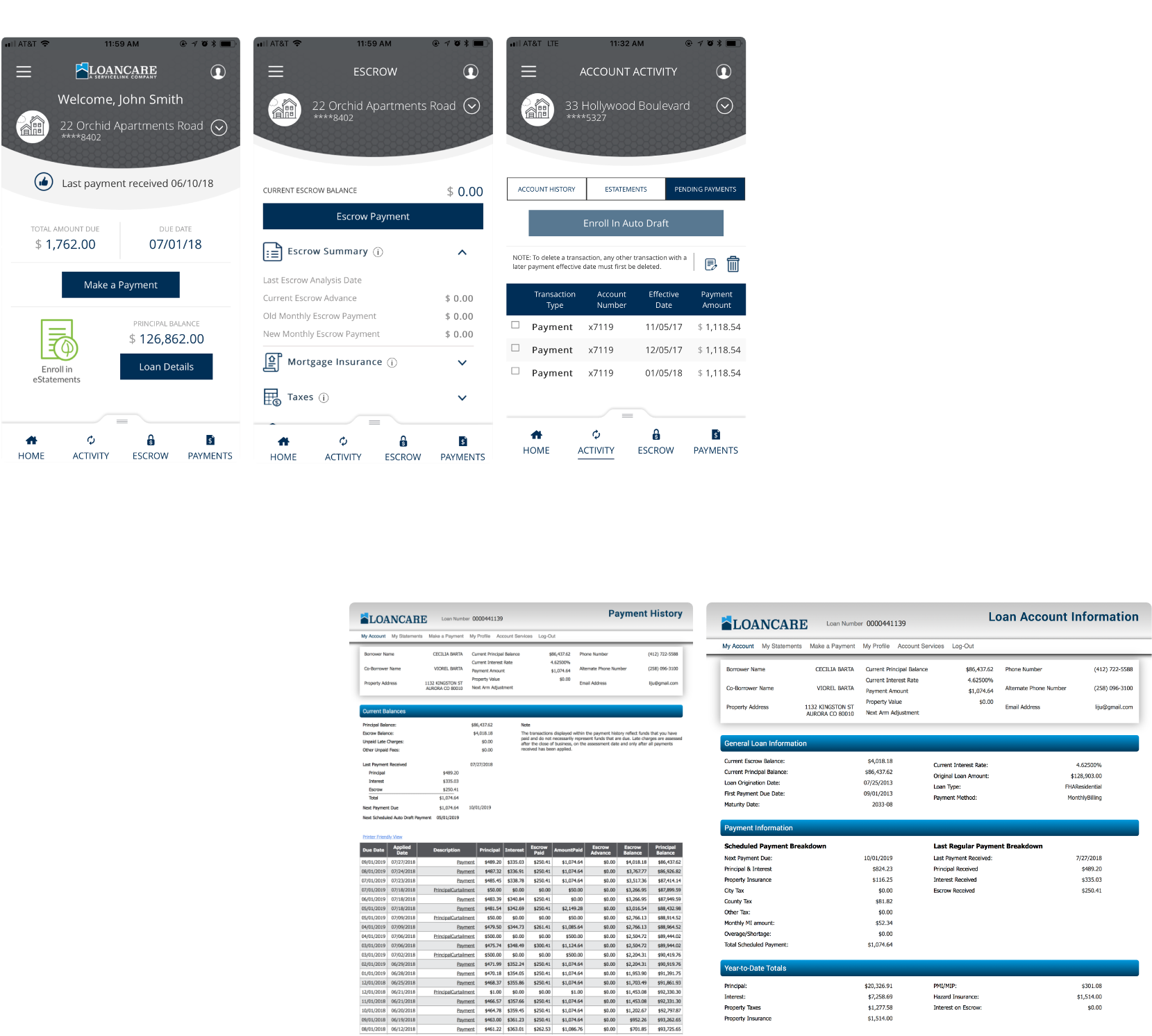
Review the Current Products
When we first started the project in 2018, we had to work with extremely tight deadlines. My team and I carried a lot of pressure since UX and UI design is the first step of the entire product development journey. Our client doesn't allow us to exclude any existing features. On the other hand, we also got the "bad news" from the lead architect - to catch the deadline, no big structure change can be made at this point.
The current product is our starting point. We spent 1 week analyzing the current mobile app and website and defined a list of key user experience problems that we had to solve no matter how tight the schedule was.
The Big Picture
Task Mapping and Information Architecture
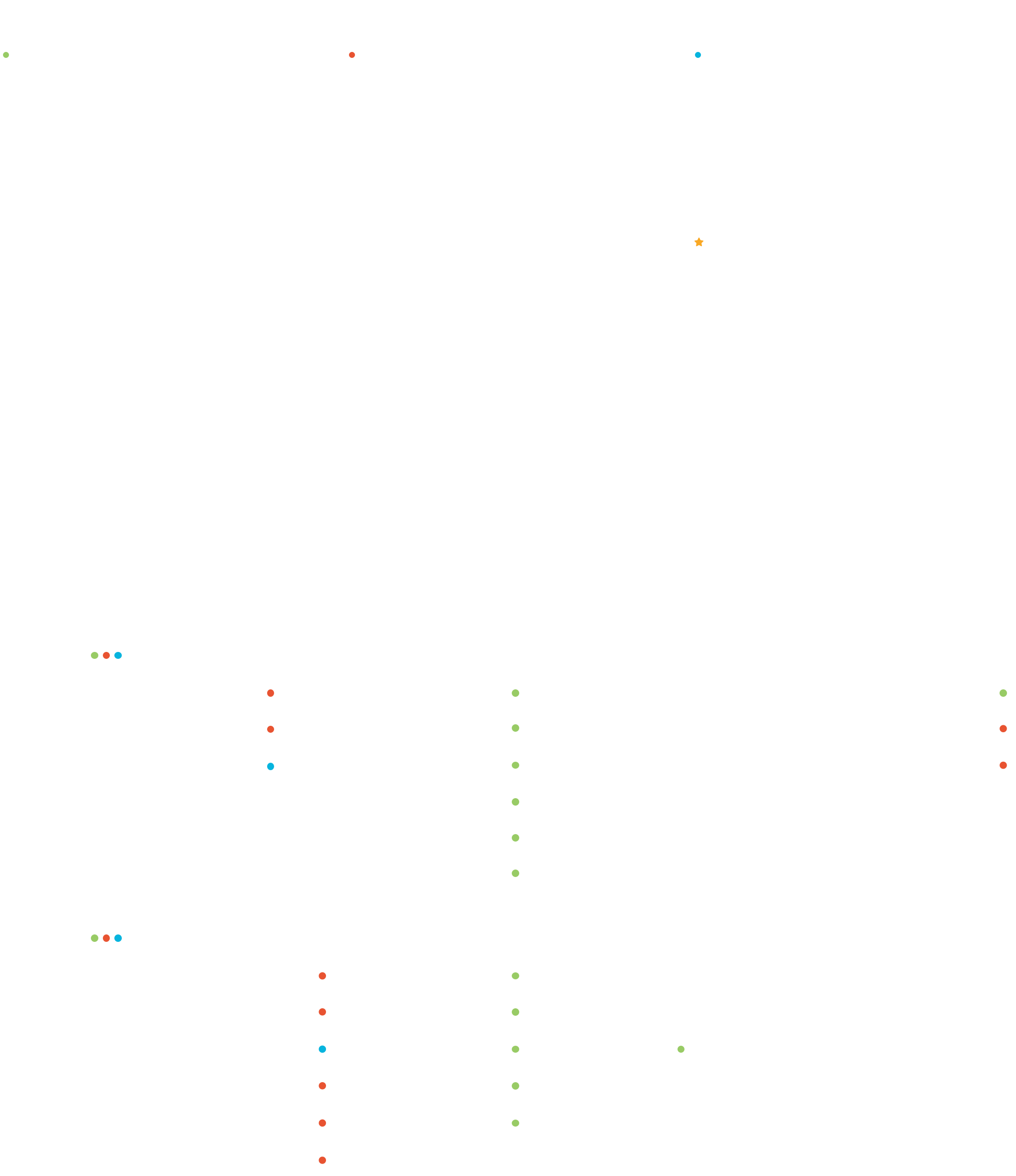
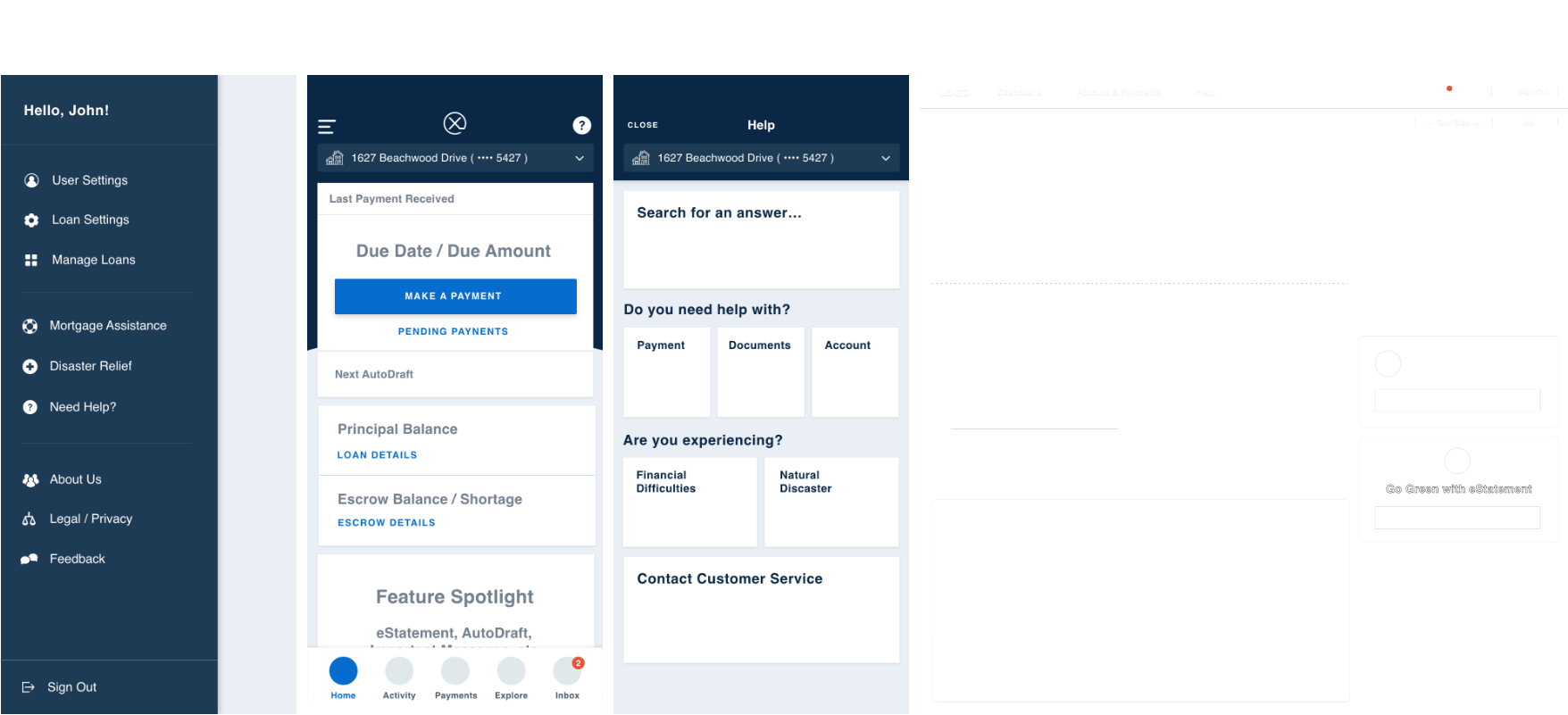
People use our product with 4 main purposes: make a payment, understand the account status, download documents, and explore loan options or investment ideas. We categorized all the 50+ features into these 4 feature groups and created the information architecture accordingly. Through this exercise, we made sure the information is logically grouped and easy to follow.
00
New User On-boarding
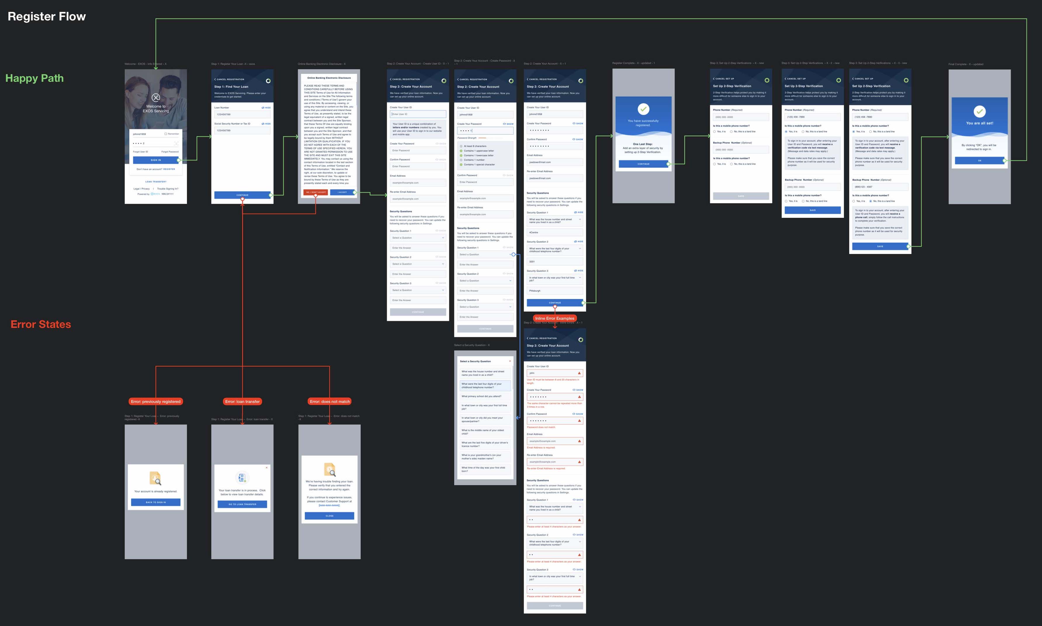
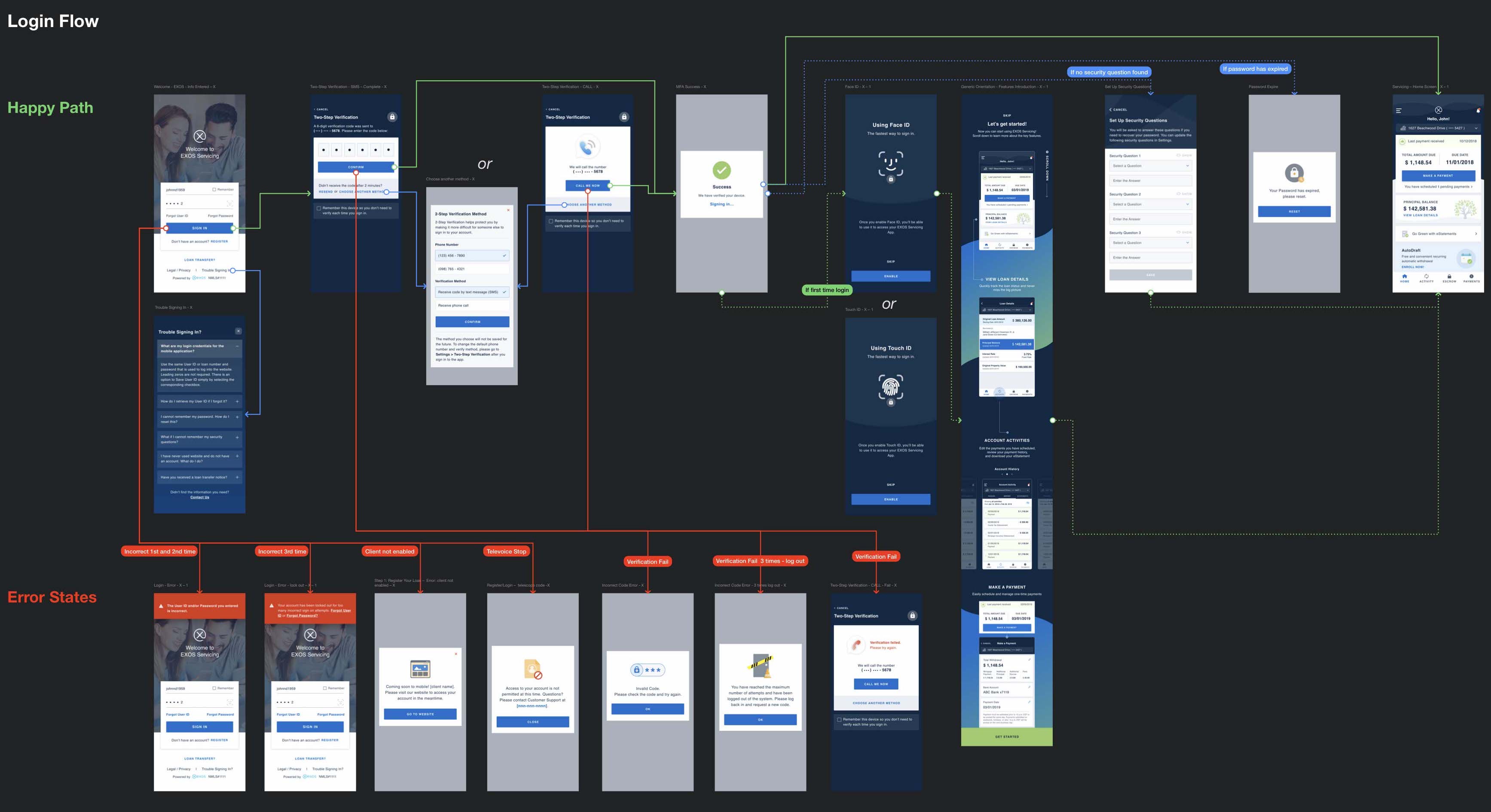
The original on-boarding experience was painful: a new user has to repeat the password 6 times before the first payment. When we first presented a shorter and more intuitive user flow, almost everybody in the room voted “no” since it required extra resources to revise the software backend.
But I was not deterred. I persuaded every manager with detailed competitor analysis; coordinated with multiple engineering teams to verify the feasibility of every step; and worked with the analysts to offer support to every corner-case.
01
Modular Dashboard
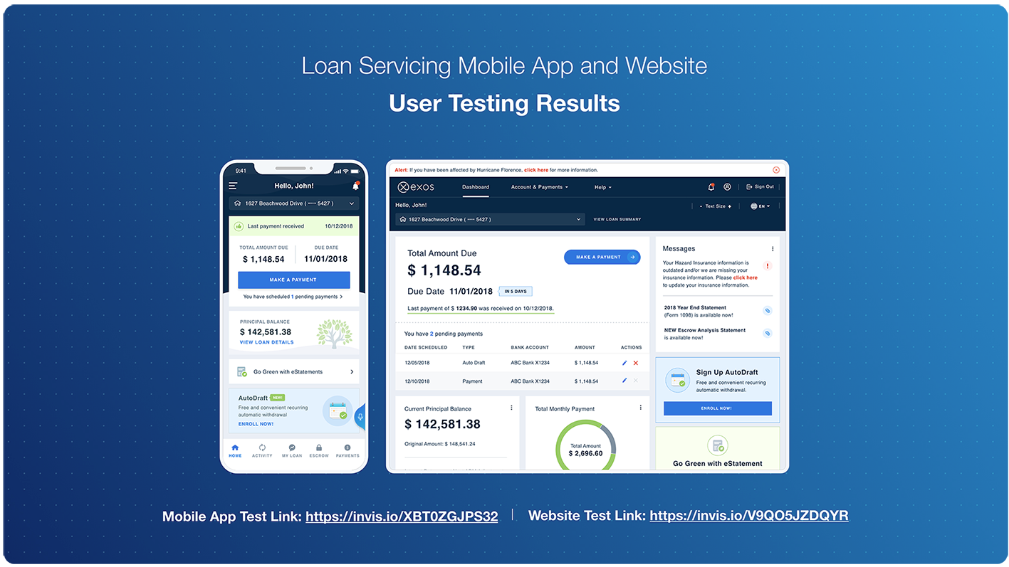
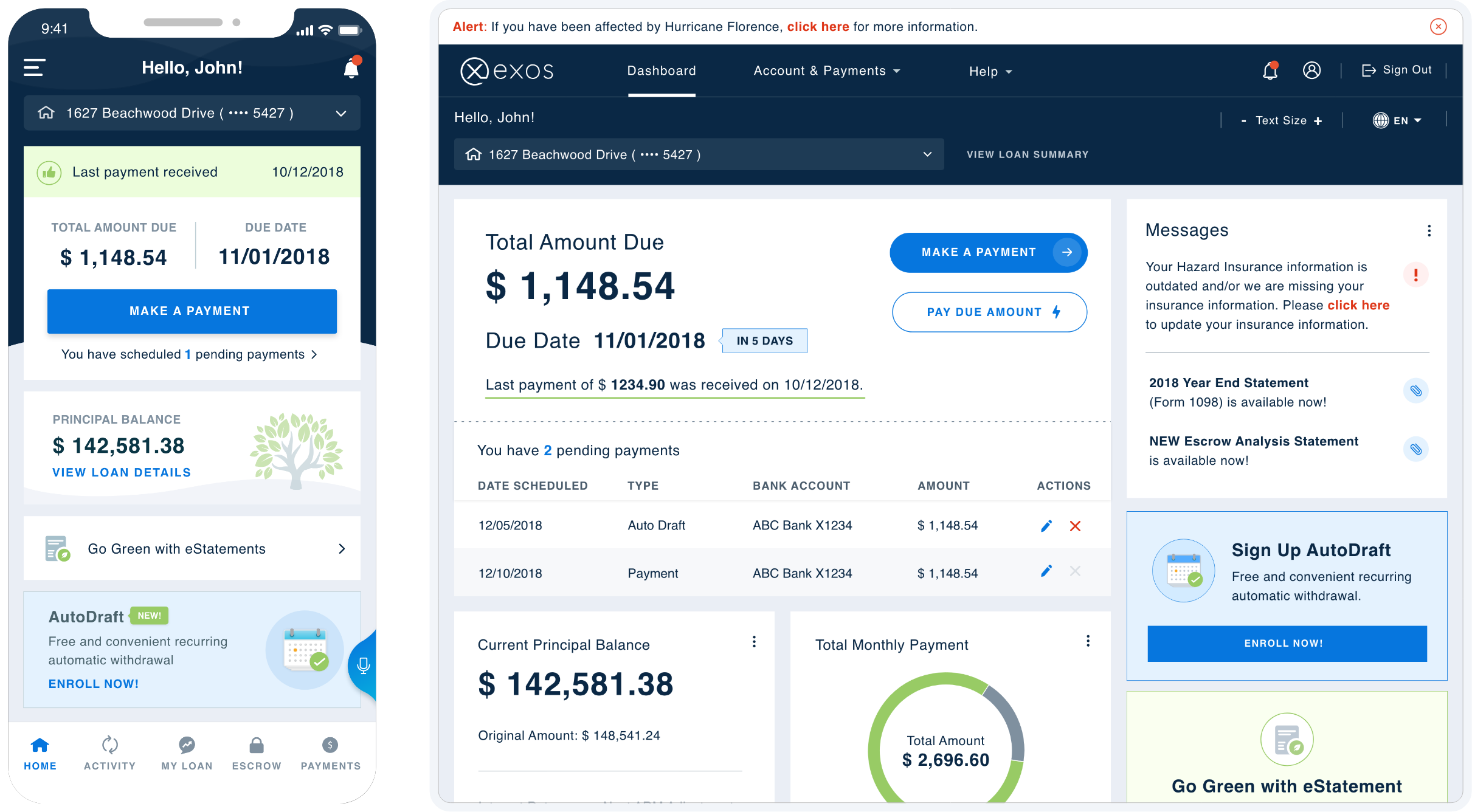
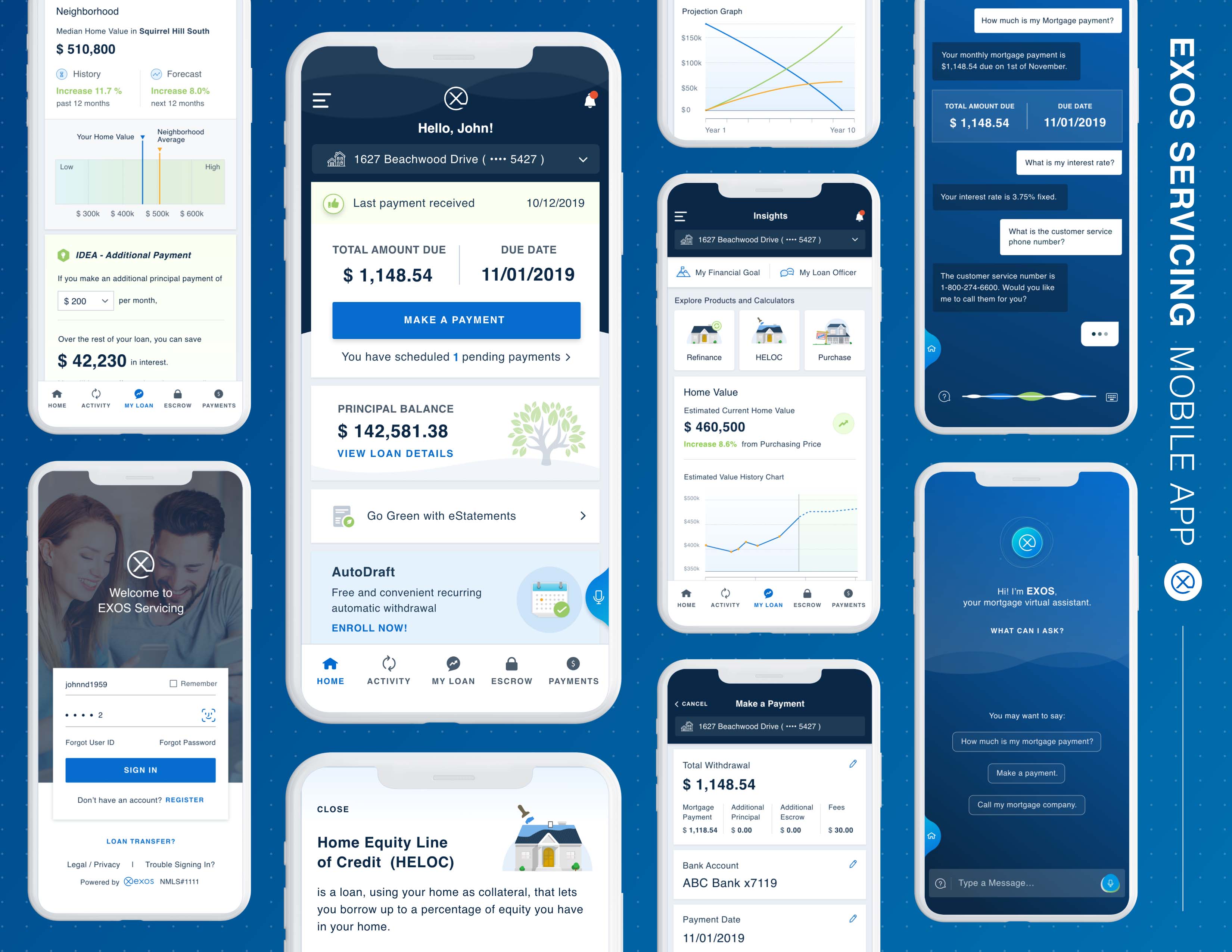
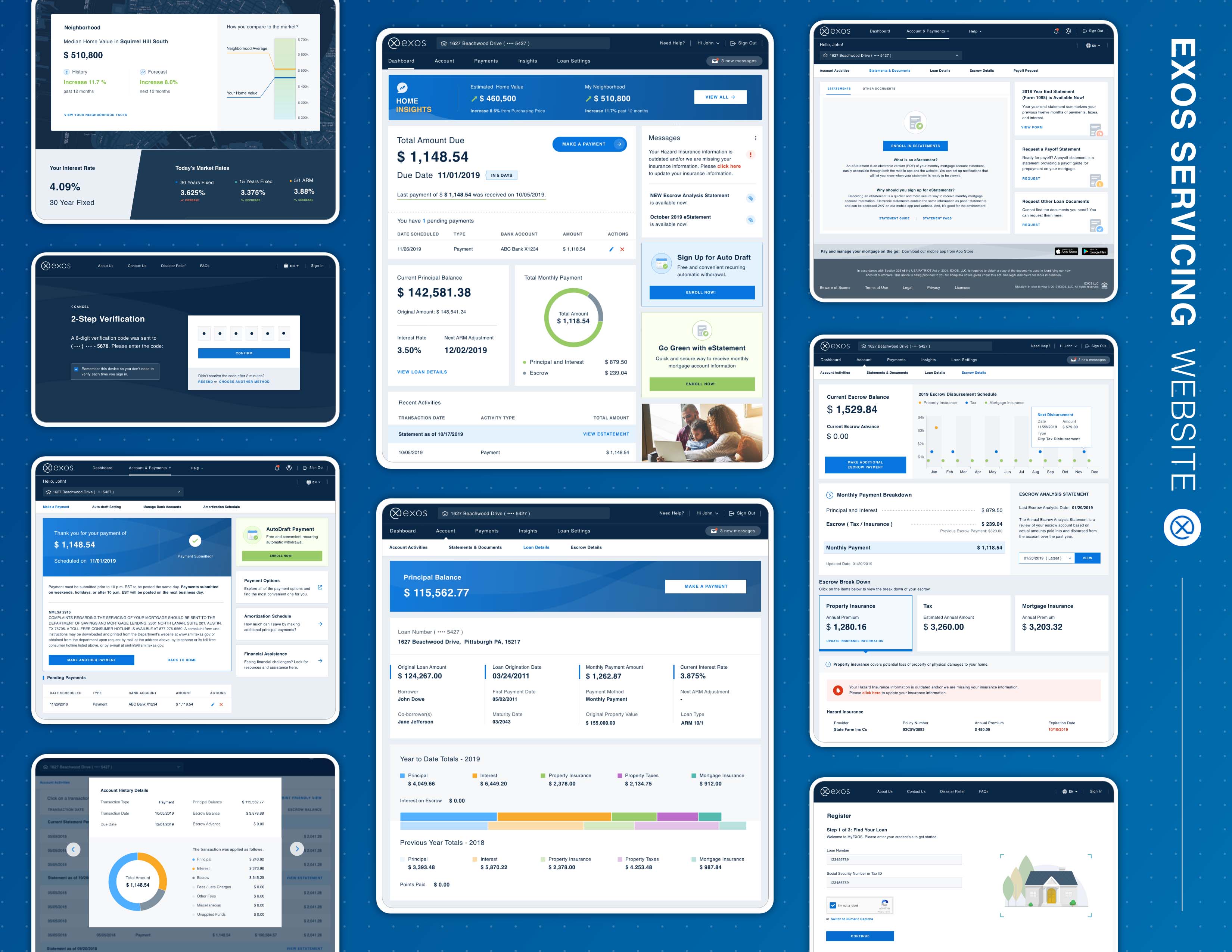
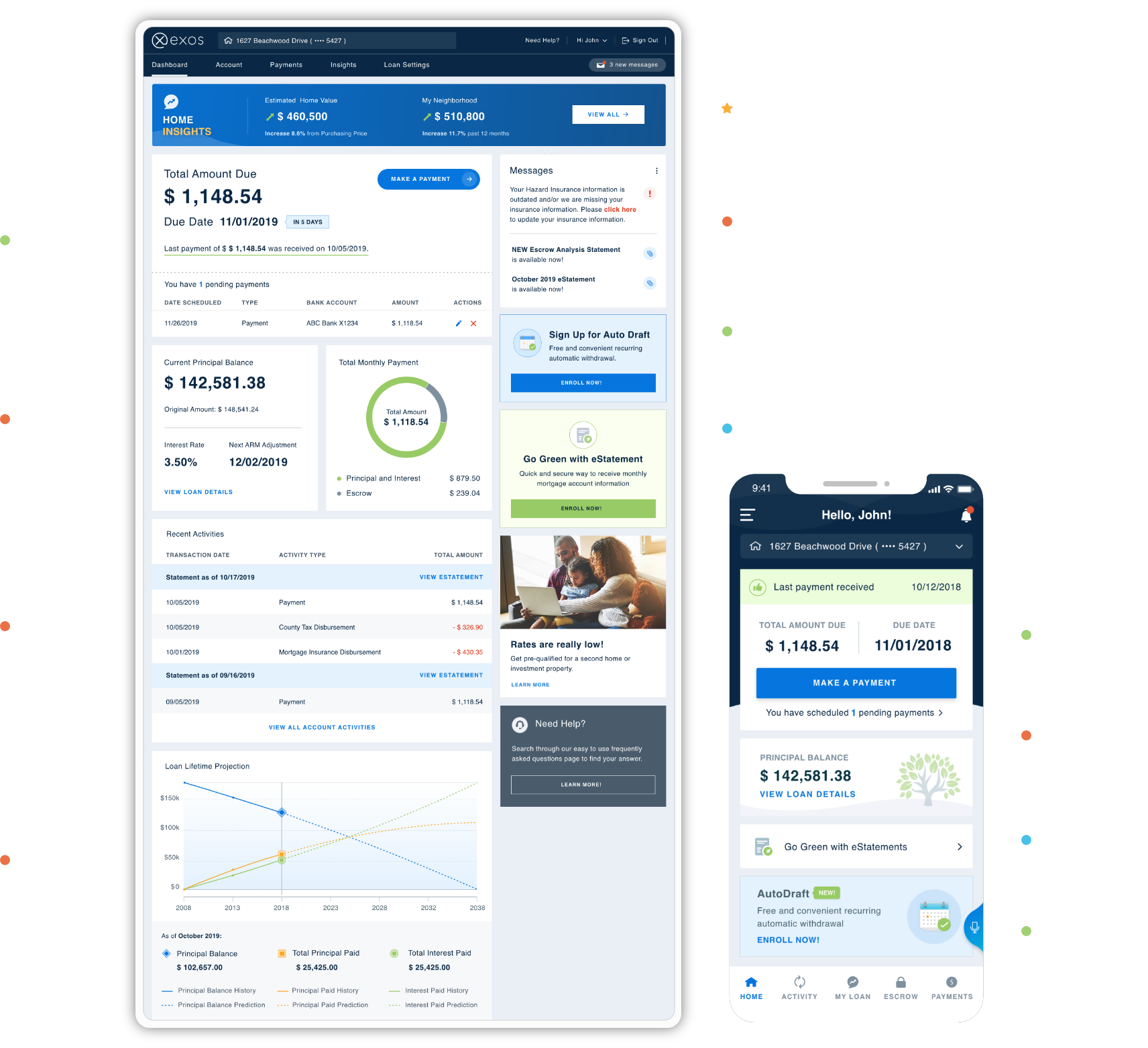
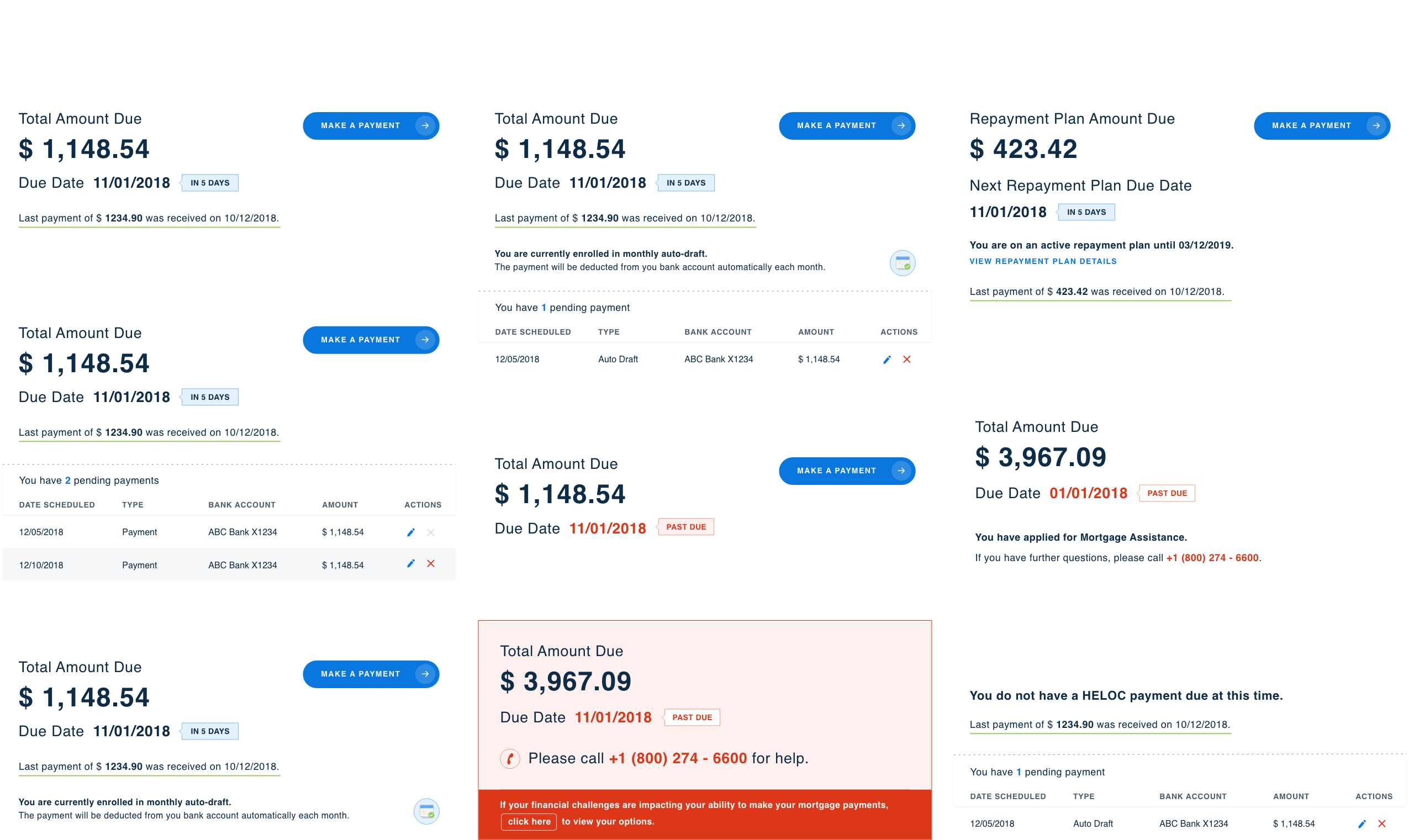
From the dashboard, users can manage all of the key aspects of their mortgage such as making a payment, reviewing payment history, viewing their latest eStatements, and adjusting their profile settings. Each card on the dashboard is a module. Depending on the loan's status, users will see different combinations of modules. We also allow our clients to customize the modules as needed.
02
Make a Payment
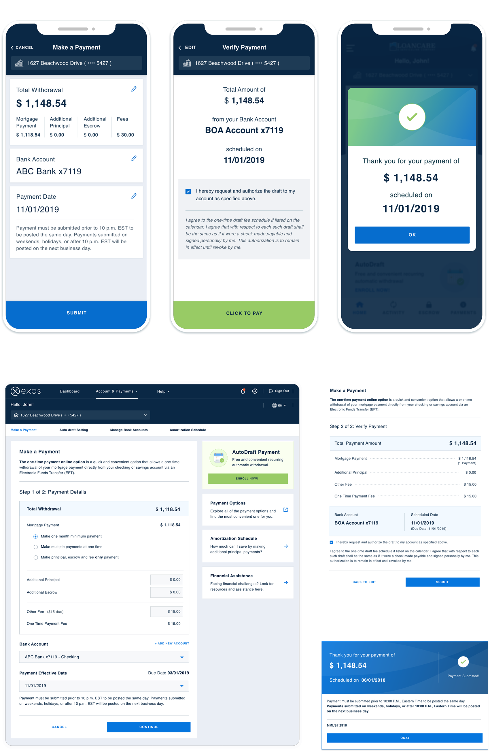
Making a payment is just 3 simple steps: view payment details, verify payment, and receive a confirmation.
03
Loan Details
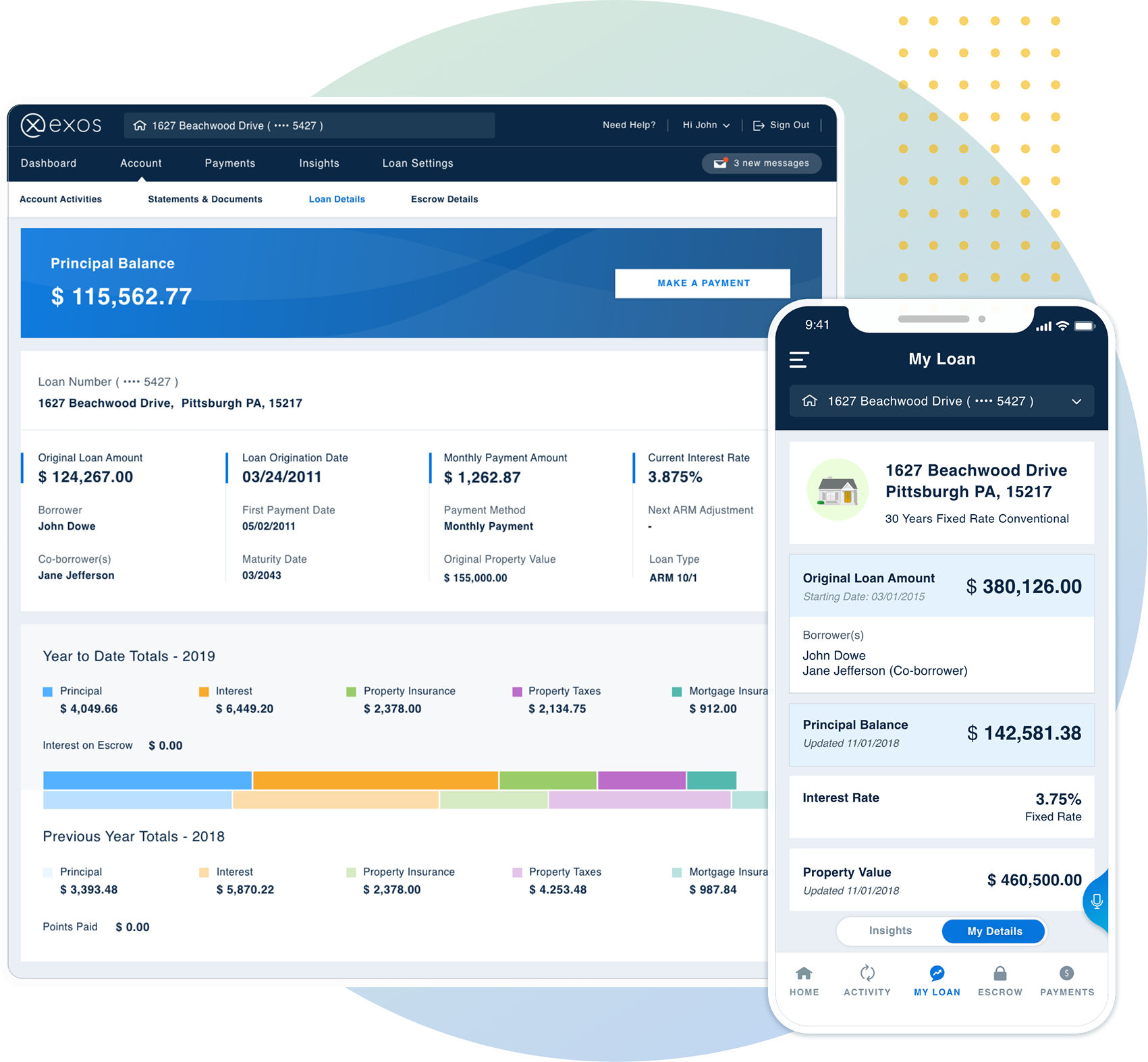
Users can access important loan details, such as principal balance, original loan amount, property value, escrow balance, co-borrowers, and interest.
04
Escrow Details
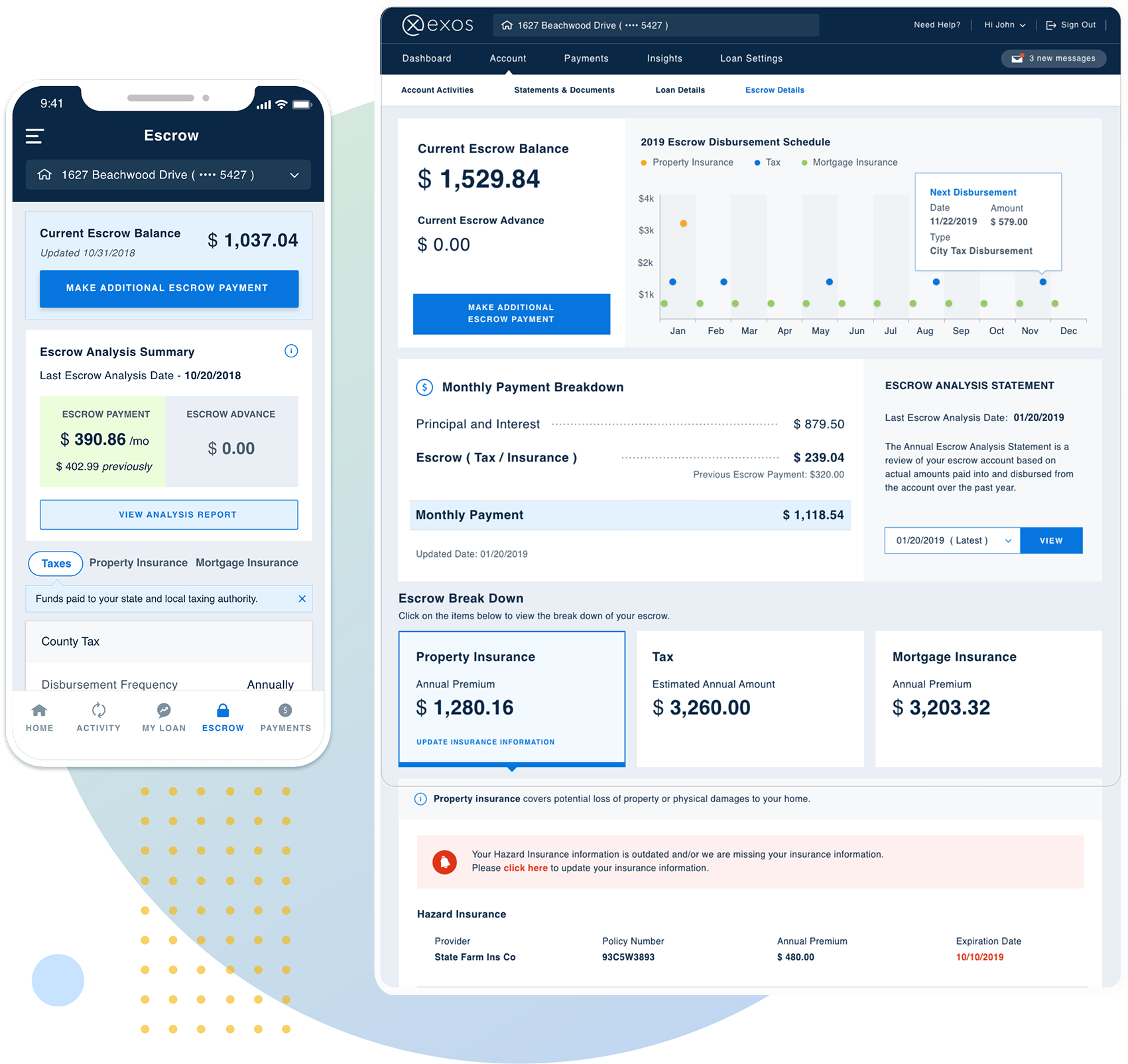
Users can view the balance of their escrow accounts, make escrow payments, download annual escrow analysis reports, and read the breakdown of escrow details.
05
Home Insights
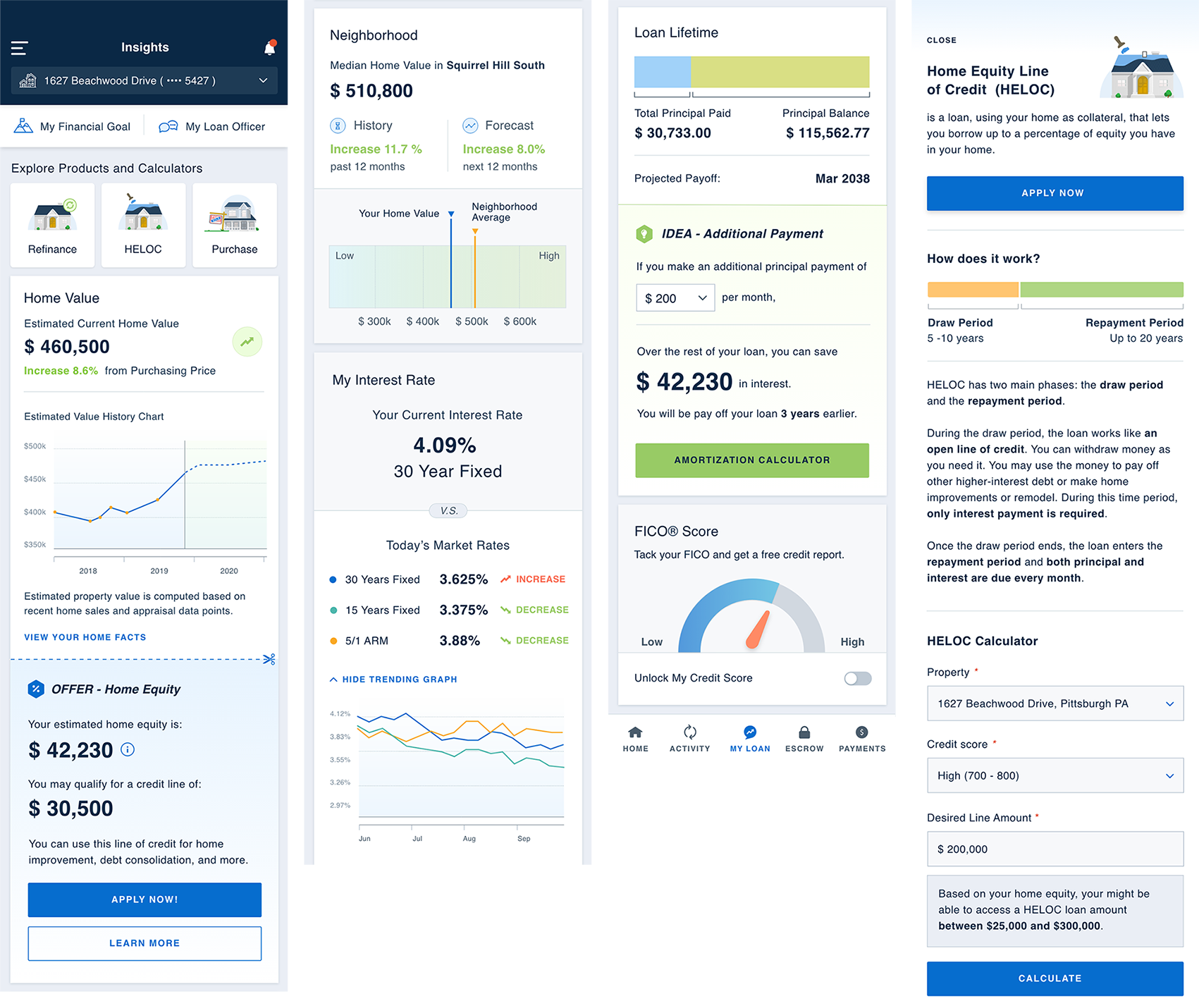
We analyze loan payment history and home/neighborhood property value data to offer personalized savings and investment recommendations.
07
Responsive Design
We made sure the website is fully responsive from desktop to mobile.

Private Labeling
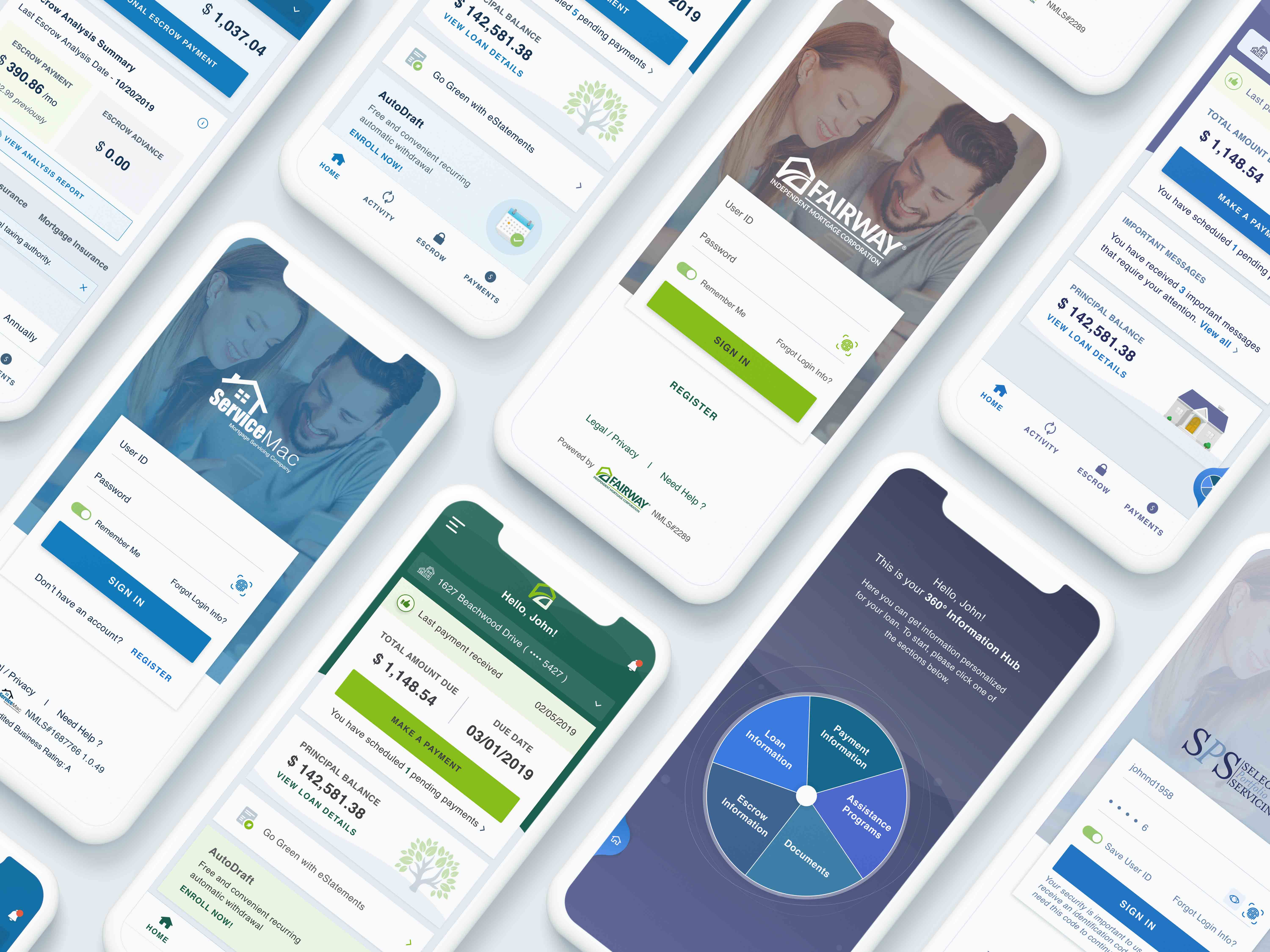
Our product is private-labeled (created by one company and sell under another company's brand) for 40+ lenders. We provide two levels of customization: branding private labeling and feature customization.

Thank you for your attention!
Drop me a line at yingw4@tepper.cmu.edu.
View the next project to learn more:
