EXOS Valuation Order Management Platform
How to manage Complexity?
Project Type
User Experience
Visual User Interface
Enterprise Application
Team Size
Design Team: 2
Engineering Team: 30+
My Responsibilities
Interaction Design
User Research
Visual Design
Project Timeline
January - April
2017
The Primary Business Management Platform
The EXOS Enterprise Order Management Web Application is the ServiceLink’s Primary Business Management Platform that is used by thousands of managers and associates. It manages the business process from start to end: receiving orders from the banks, scheduling appointments, assigning vendors, tracking order status, managing documents, and delivering the final reports. To improve work efficiency and adopt a larger scale business model, the company decided to create a brand new platform to replace the old system.
December 2017, right after I joined ServiceLink, I was assigned to this project as one of the earliest members.
Understand the Complexity
The EXOS Enterprise Order Management Web Application is the ServiceLink’s Primary Business Management Platform that is used by thousands of managers and associates. It manages the business process from start to end: receiving orders from the banks, scheduling appointments, assigning vendors, tracking order status, managing documents, and delivering the final reports. To improve work efficiency and adopt a larger scale business model, the company decided to create a brand new platform to replace the old system.
December 2017, right after I joined ServiceLink, I was assigned to this project as one of the earliest members.
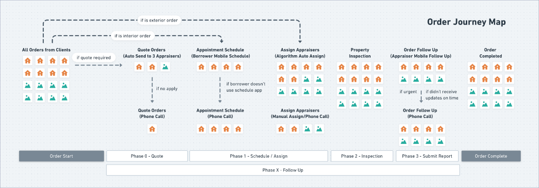
After 2 weeks of study, I created a journey map to document how an order is handled step by step.
Understand the Complexity
The first challenge is to understand the complicated business process and workflows behind the software. There are a couple of reasons why the process was extremely difficult to understand: First of all, the software is used by 3 business lines. Each of them has various sub-teams and every team manager only looks at the product from one angle. We had to manage very different expectations when we talk to each team. Ignoring any unique need can lead to a gap in the business flow. Second, the company’s business process has a half-century history. Over the years, teams have had created many business rules to solve problems or manage clients’ requirements. Some of these solutions are “temporary hacks” caused by technical debt. Last but not least, I am a newbie in the mortgage finance industry. When I talked to the operation managers who have spent decades in the company, they naturally used industry-specific jargon. It was extremely difficult for me to understand these abbreviations and terms.
I did two things to help myself get to know the existing business process: 1) I took a lot of notes during daily business requirement meetings and spent extra hours to learn mortgage terms and industry-specific knowledge after work. 2) I conducted user shadowing with 8 associates from 3 business teams who use the current application day-to-day and wrote down every action they took.
After 2 weeks of study, I created a journey map to document how an order is handled step by step.
The Current Software
During the User Study, I noticed that the current platform has two main usability issues:
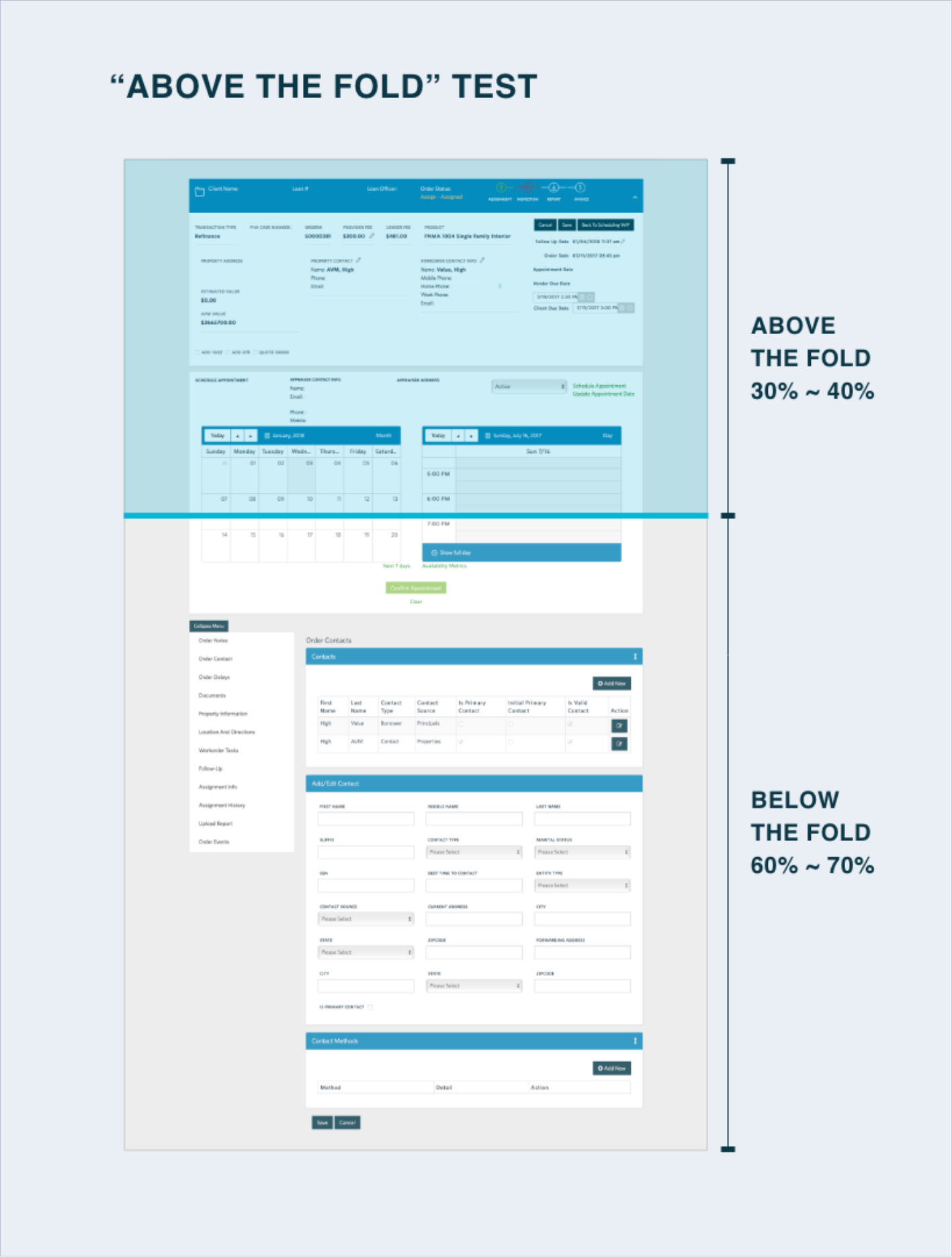
1) To assign or follow up with a vendor, a user has to keep on scrolling up and down multiple times. Three elements are needed to complete a task: the order summary and vendor contact (on top of the screen), the schedule/assign panel (in the middle), and notes (at the bottom). This layout creates a heavy cognitive load for the users.
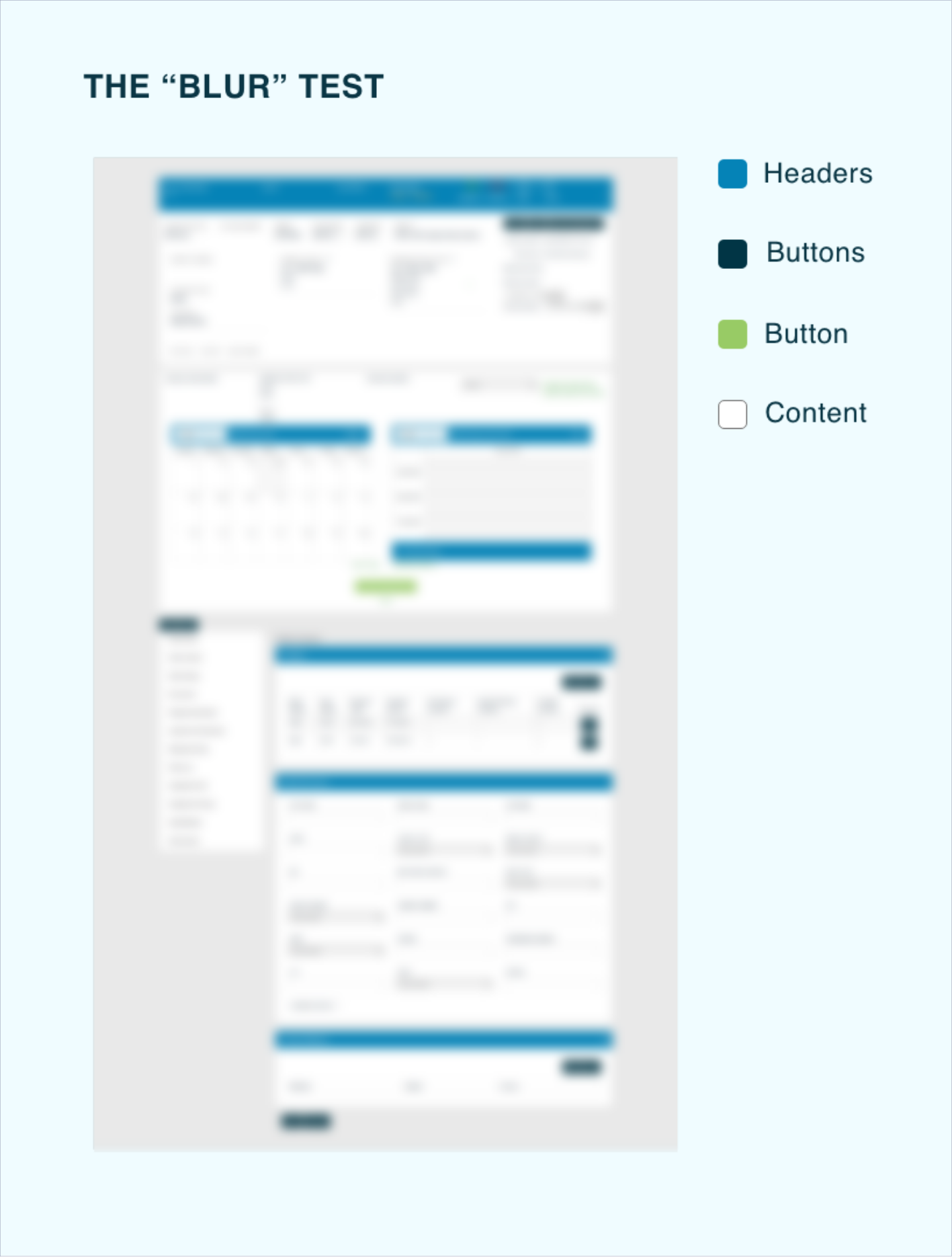
2) The visual priority doesn’t align with the information priority. The headers are all in dark blue color and are more eye-catching than the content itself.
The new Layout
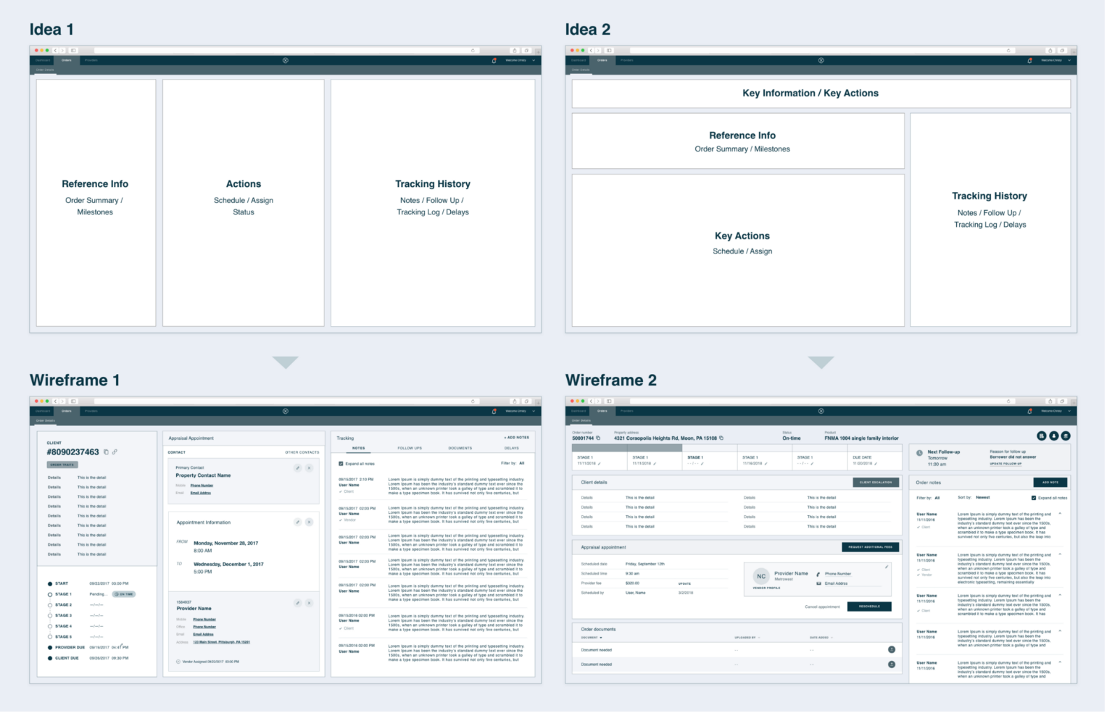
Users always need 3 modules to complete a task: order summary (what is the status), order notes and tracking (what has happened), and order action panel (to complete the task). We tried different layouts with a common idea in mind - allow users to access these three modules at the same time.
We brought our wireframes back to the business managers. The business appraised our idea of keeping all the key elements "above the fold" while pointed out a potential risk that users may get lost in the information. It is crucial to give users, especially the new hires, clear guidance: tell them what they have to complete for this order. Then the system must check if the task was handled as expected.
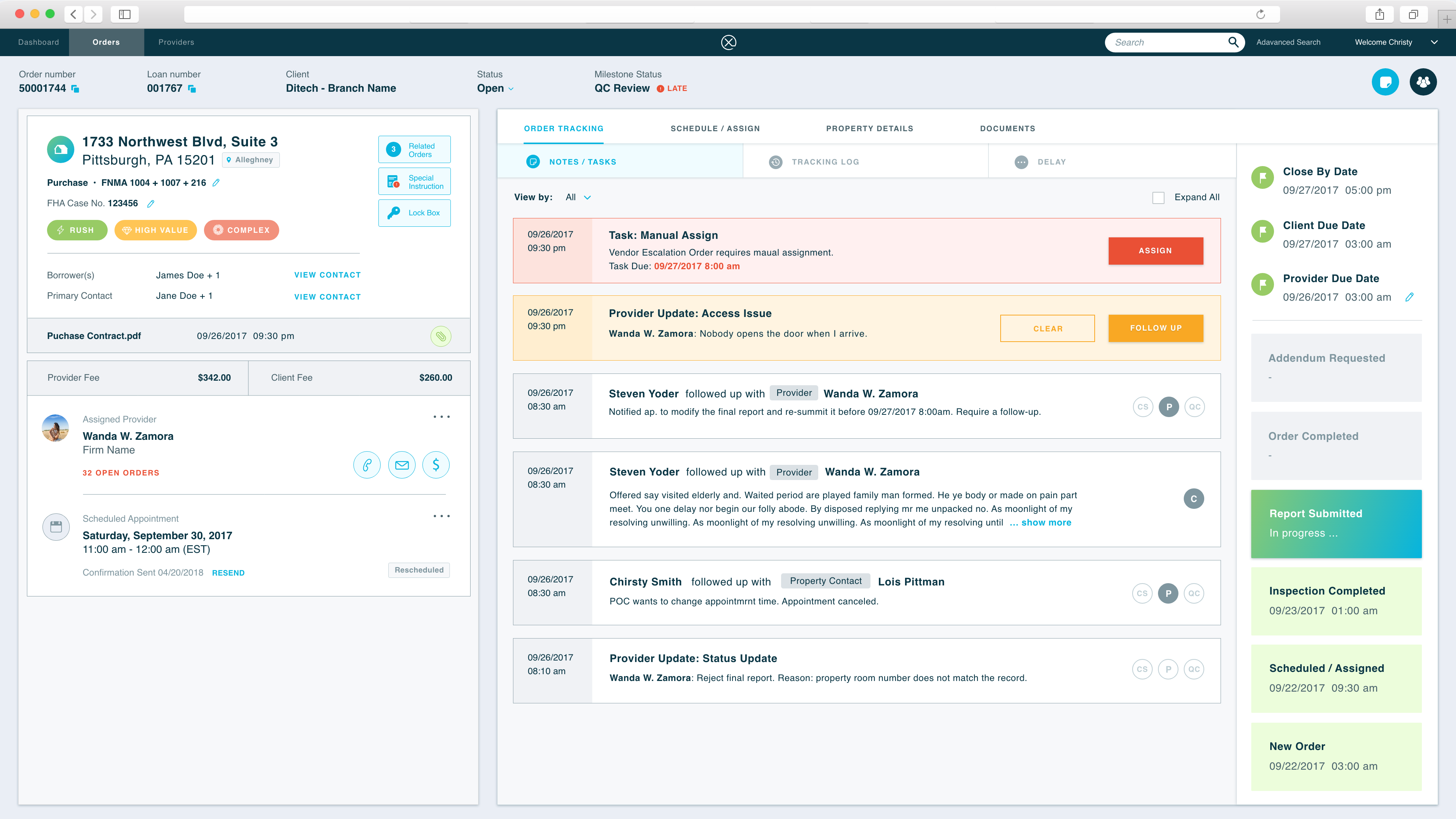
Therefore, we introduced the "task" module - all the actions are driven by the assigned "task". The "task" needs to be the first thing users see on the screens. Users just need to follow the task instructions step by step.
The "Get Next" Logic
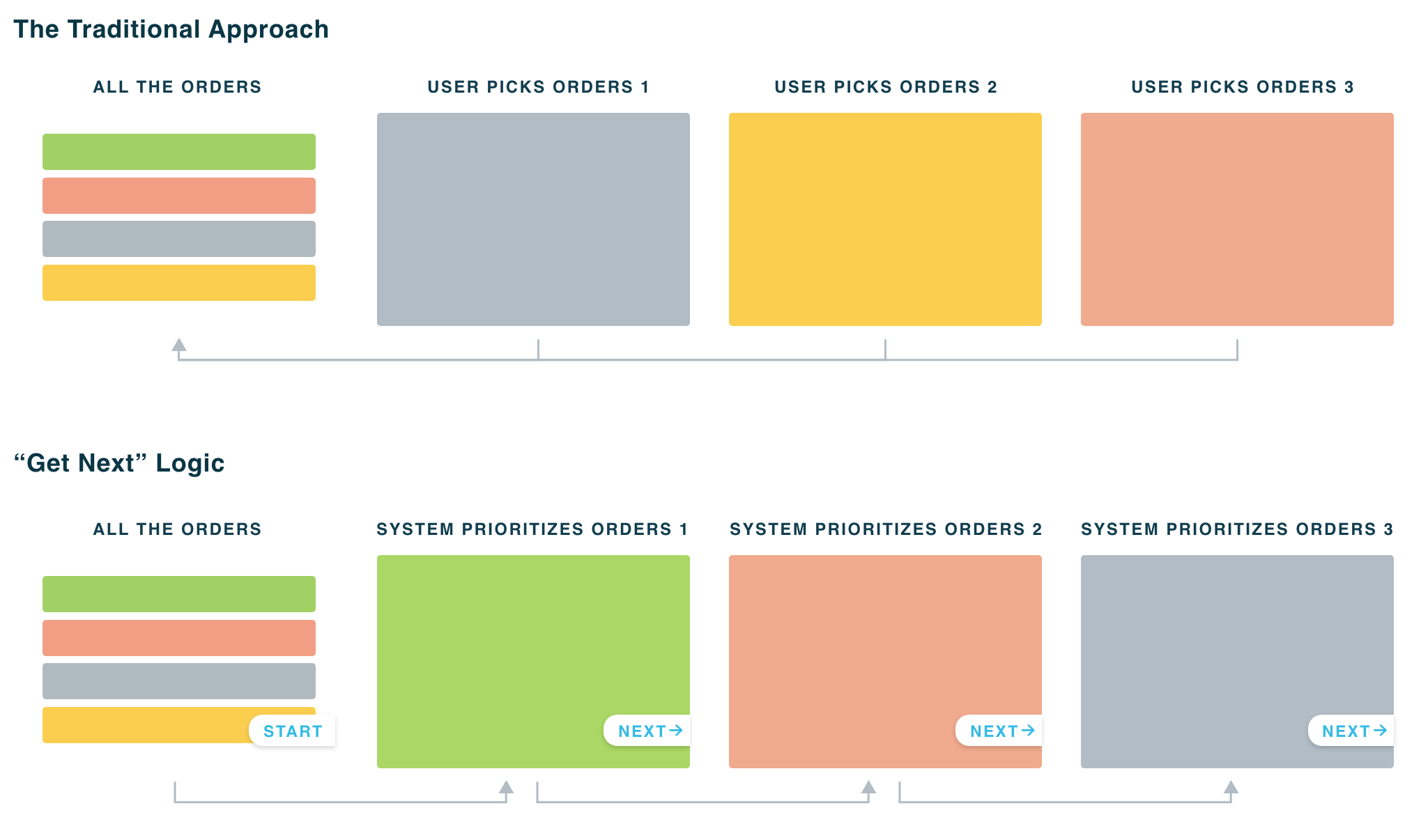
In the old system, we allow users to prioritize orders and pick orders based on their preferences. When talked to the managers, we learned that giving users full access and freedom does not bring efficiency to the company - users spend a lot of time doing "cherry-picking" because everyone wants to work on the "easy" tasks first. There is another problem: whenever the user completed an order, s/he has to go back to the order list and reselect the next one. It is time-consuming.
We came up with a new "Get Next" logic. The algorithm will prioritize the orders based on the due date and users' capabilities. Once an order is done, the only thing users need to do is clicking the "get next" button to bring up the next one.
User Testing feedback
I created click-through prototypes and tested with 2 managers from the operation team. During the test, we mimicked the real work setting - users have to make phones while quickly search for information and make decisions. Based on the test feedback, I adjusted the location of certain elements. For example, I moved the contacts panel from the left to the right side of the screen because users have to look up contact information while referring to the order basics.
Meanwhile, I also discussed with the engineering team and modified some interaction patterns to make the design more feasible for exiting data structure.
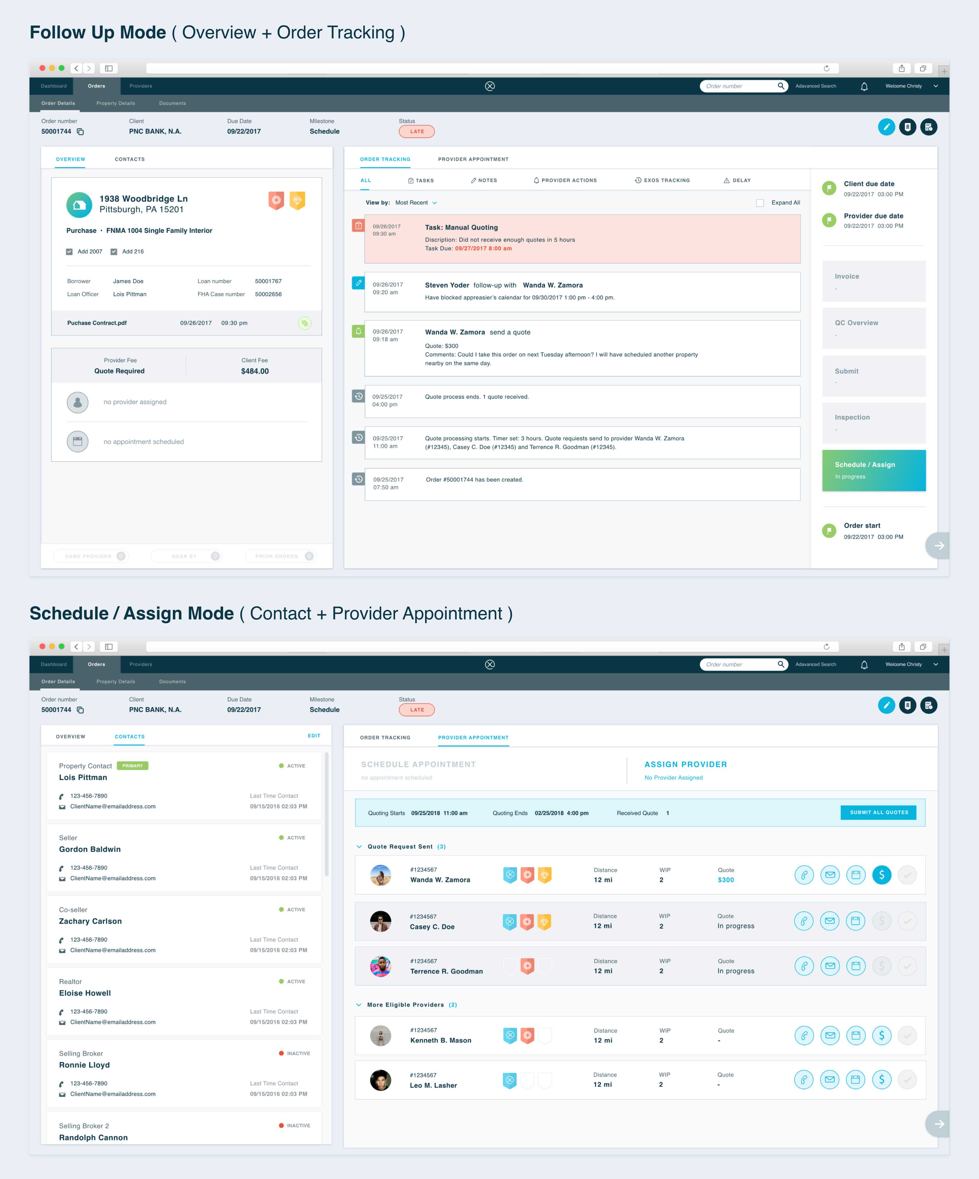
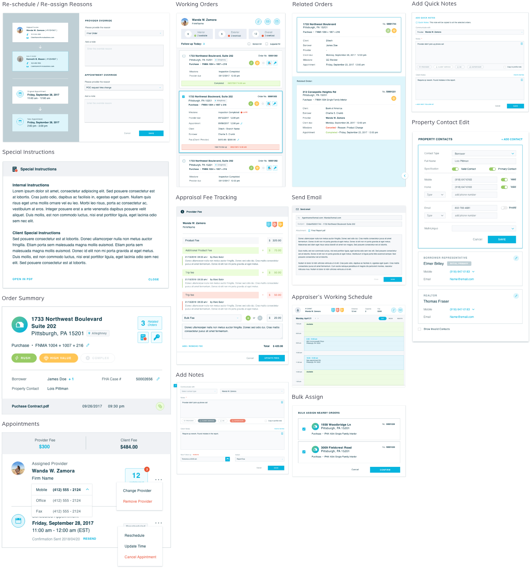
Order Schedule and Provider Assign
When users receive an Order Manual Assign Task, they call the borrowers to understand their availabilities. Each time when a time slot is selected, a list of available providers will show up. We display data points such as distance to the property, daily capacity, fee charged, and performance to help users make the best decision.
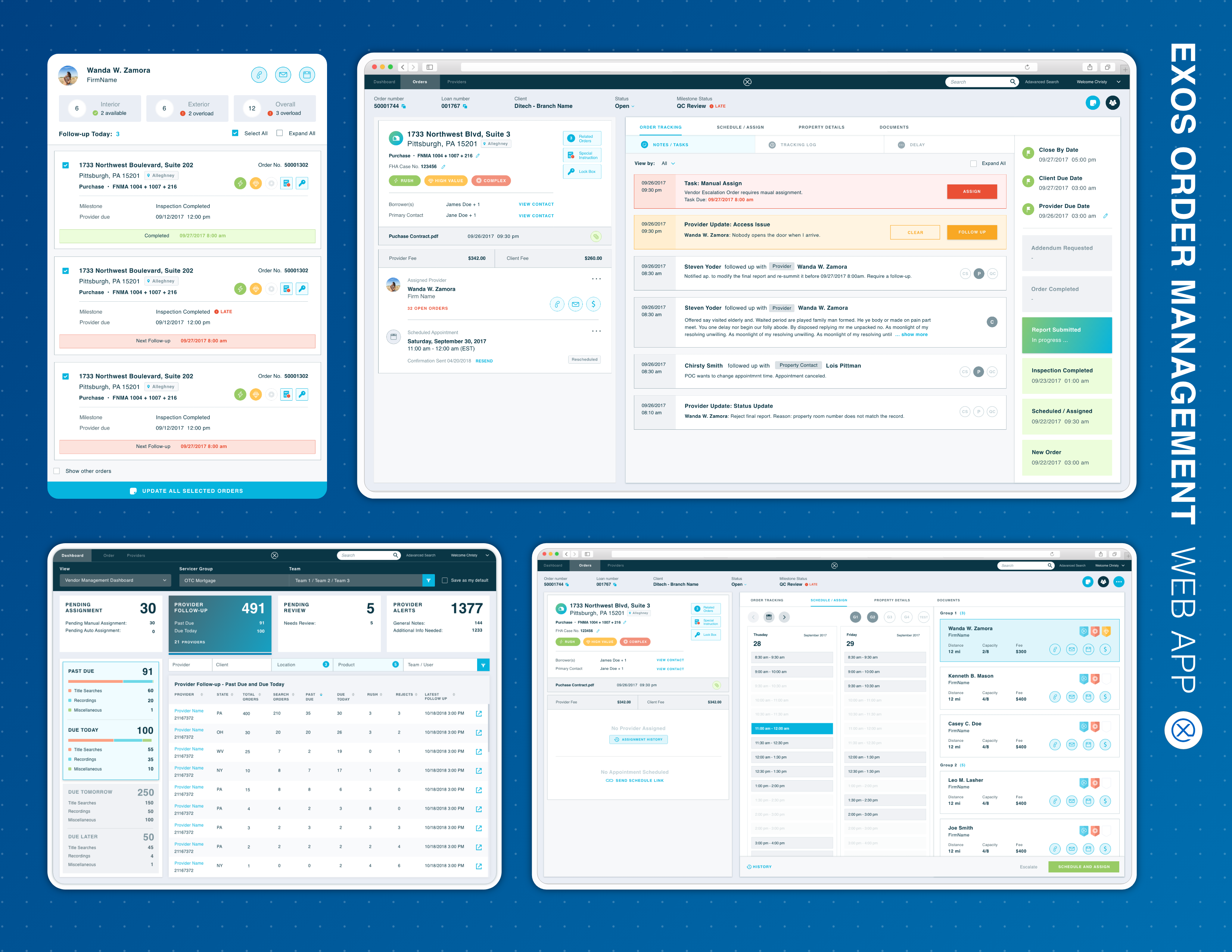
Order Search
The Order Search feature allows users to quickly locate an order by entering either the order number or other order details (advance search).
Property Details
The Property Details screen gives users a glimpse of the property information. When calling the borrowers or real estate agents, users can verify the property information on the phone.
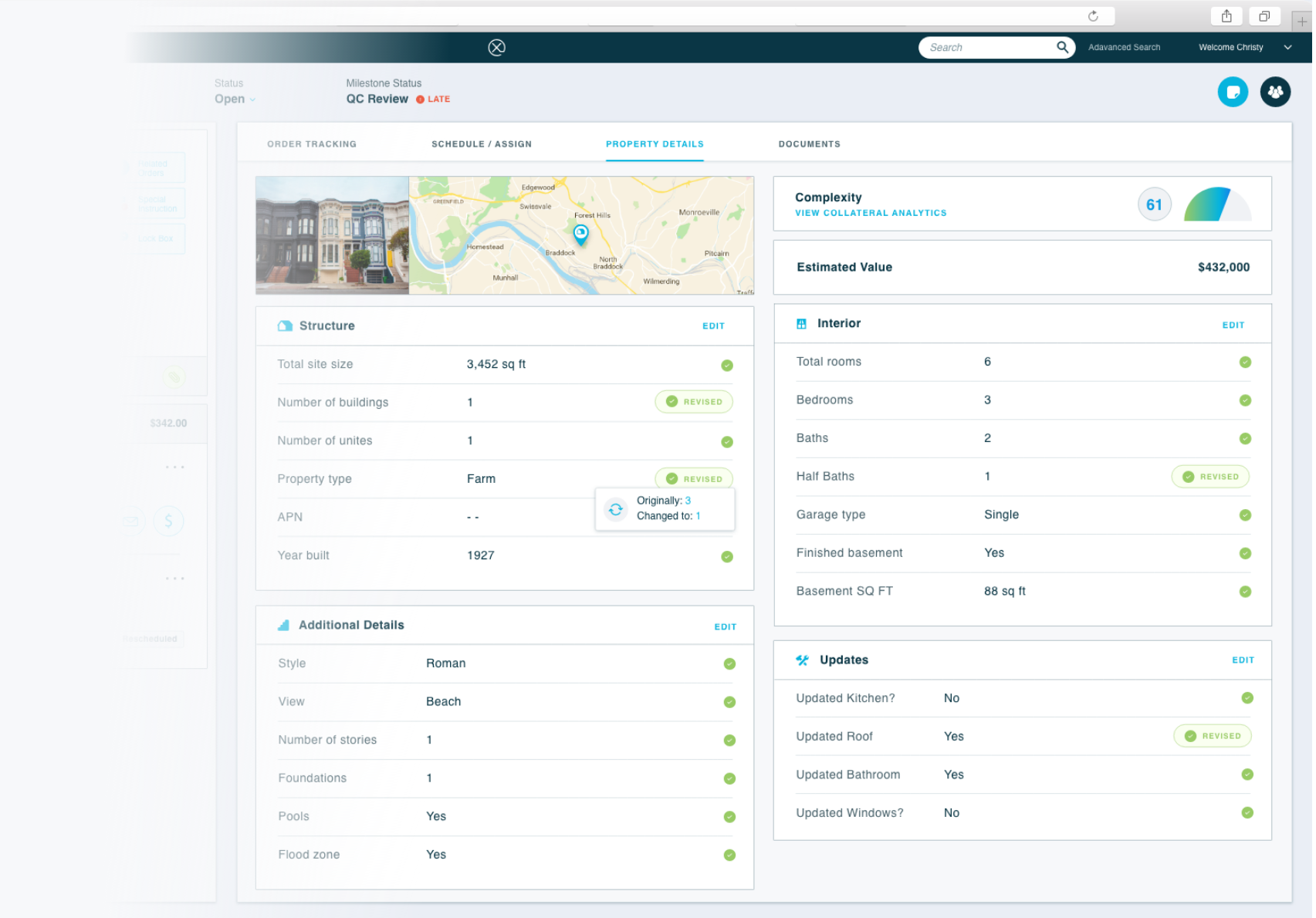
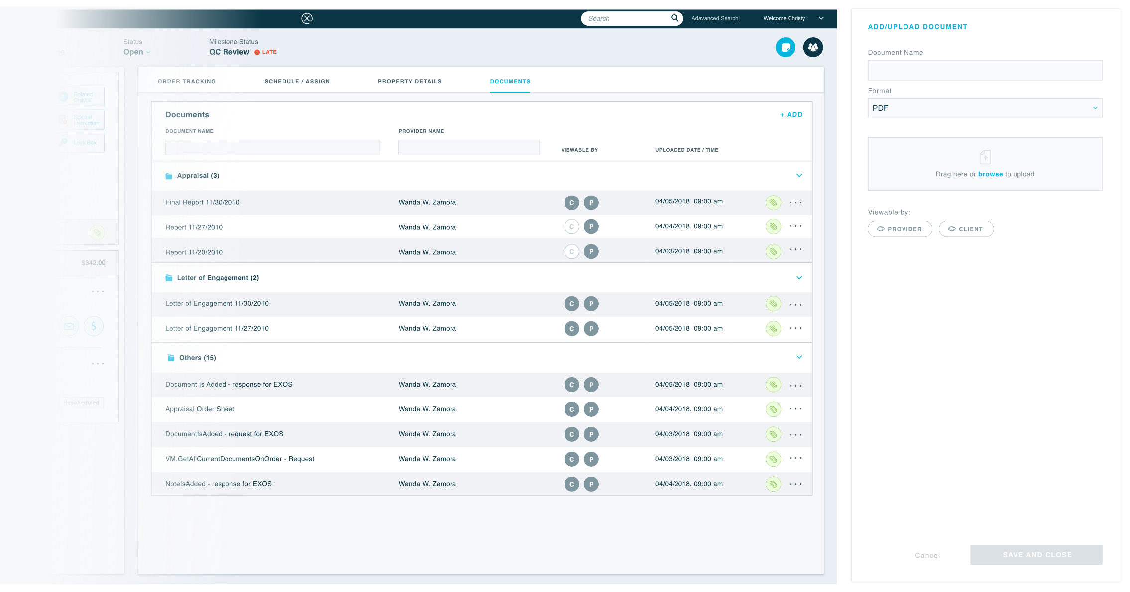
Order Documents
The Order Documents screen gathers all the order related documents including the Initial Agreement, the Order Sheet, and the Final Appraisal Report, etc. Users can upload, download, and review documents via the platform.
UI Components/Patterns
I designed a list of reusable UI components and patterns: notes editing, fee tracking, related orders, provider working orders, property contacts, etc. These elements built the foundation of our EXOS Enterprise Design System and its Pattern Library.
User Feedback Study
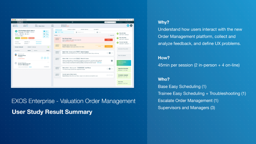
One year after the product launch, I initiated the process of user feedback collection. I conducted 6 user studies to understand how users interact with this new Order Management platform, collect and analyze feedback, and define UX problems. Read the report to learn the 5 key insights of this study.

Thank you for your attention!
Drop me a line at yingw4@tepper.cmu.edu.
View the next project to learn more: