
Project Type
Design System
Components Library
Team Size
UX Design Team: ~5
UI Dev Team: ~4
My Responsibilities
Design Lead / Project Manager
• Prioritize and Manage All the Features
• Design UI Components and Interaction Pattern
• Create Documentation and Usage Standards
Project Timeline
2020 - 2021
Why is it important?
For Better Efficiency & Consistency
By 2019, our team managed a broad portfolio of web and mobile applications spanning four lines of business and four distinct user groups. The work involved over 10 in-house UX designers and UI developers, along with multiple teams of third-party consultants collaborating on UI creation in parallel.
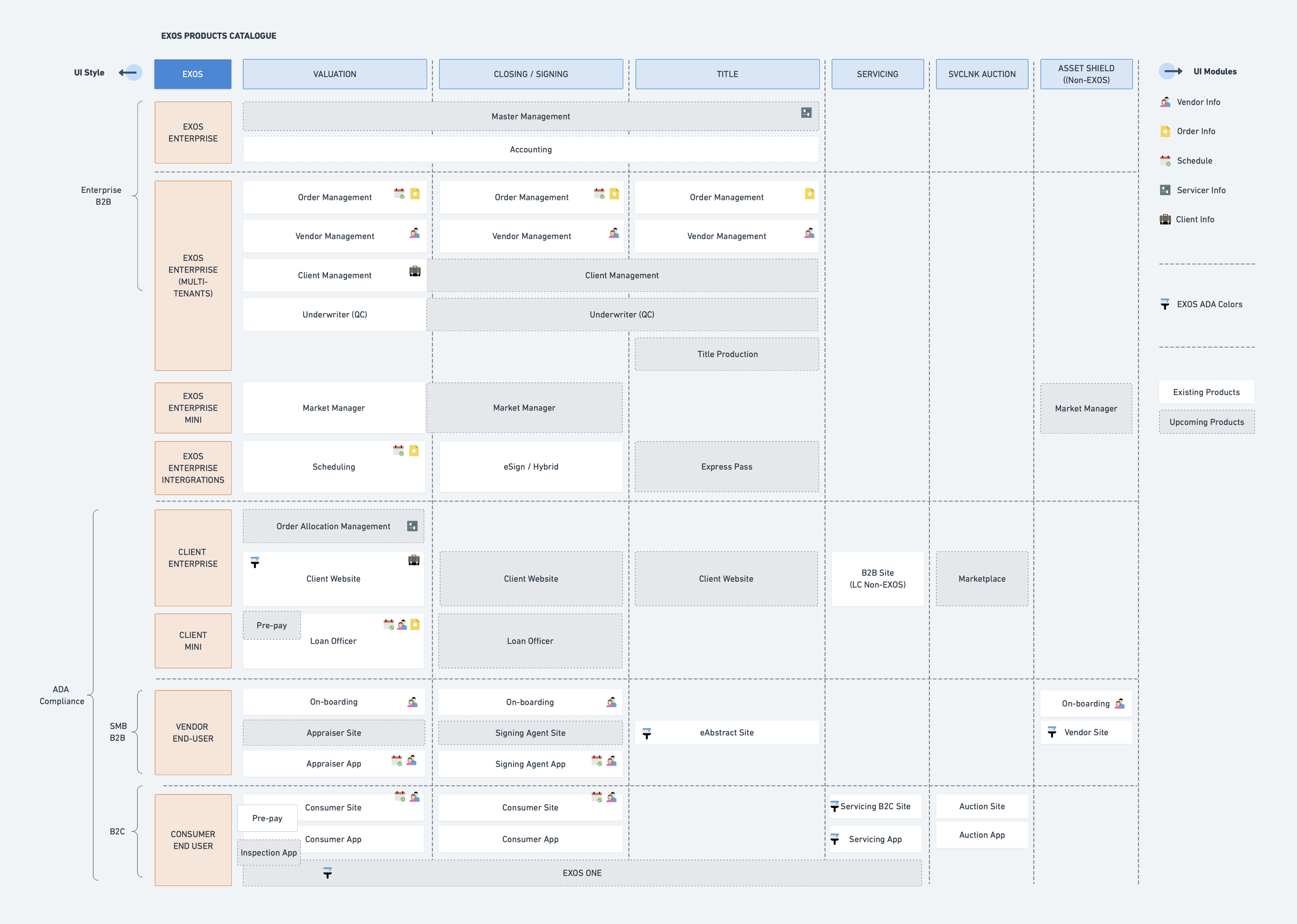
Building a large-scale platform like EXOS involves many teams working over long periods of time, which makes coordination increasingly difficult. Over time, unclear documentation, fragmented communication, and knowledge gaps compound.For every new feature, teams faced a recurring tradeoff: spend significant time tracking down reusable designs and code, or move faster by rebuilding from scratch. Both paths were costly—either slowing teams down or introducing inconsistency and duplicated effort.
We needed a central place where all teams could share, reuse, and contribute commonly used UI elements.
What drives the design system?
The Concept
4 Levels
Inspired by Brad Frost’s Atomic Design framework—atoms, molecules, organisms, templates, and pages—we organized our design elements into four levels:
- Foundation: style guidelines such as colors, typography, iconography, spacings
- Components: the smallest fundamental units as inputs, buttons, cards, and tags
- Pattern: basic functional building blocks such as navigations, modals, data tables, and data entry forms
- Layout: page structure and arrangement rules such as grid system and common templates
2 Platforms
While the web and mobile platforms shared the same experience principles and visual language, they relied on different native components. On the landing page, we provided two separate entry points for each user group.
6 Experience Values
We began with a team brainstorming session to identify words that described a successful EXOS product. Through discussion and clustering, we ultimately defined six experience values for the EXOS platform: Empowering and Engaging, Trusted and Secure, Efficient and Automated, Robust and Reliable, Innovative and Futuristic, and Accessible and Inclusive.

Where to start?
Prioritization
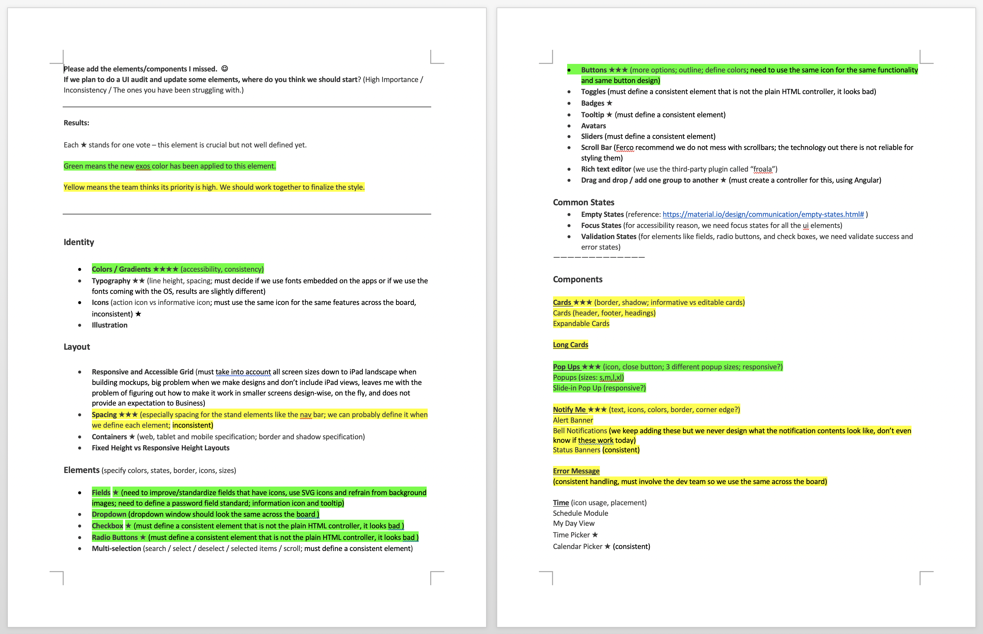
The first step was to gather the team’s input on which UI elements should be included and prioritized. We created a survey to collect ideas from all UX designers and UI developers, which helped build a feature wishlist and clarify priorities for each element.
Colors: A New Accessible Palette
With the introduction of WCAG 2.1, the industry had begun to establish clearer accessibility standards and best practices. However, the existing color palette—blue, green, red, and yellow—did not meet AA-level contrast requirements when used with white text on action buttons.

To define a new primary color, we conducted research across company branding, in-product usage, and color-combination accessibility.
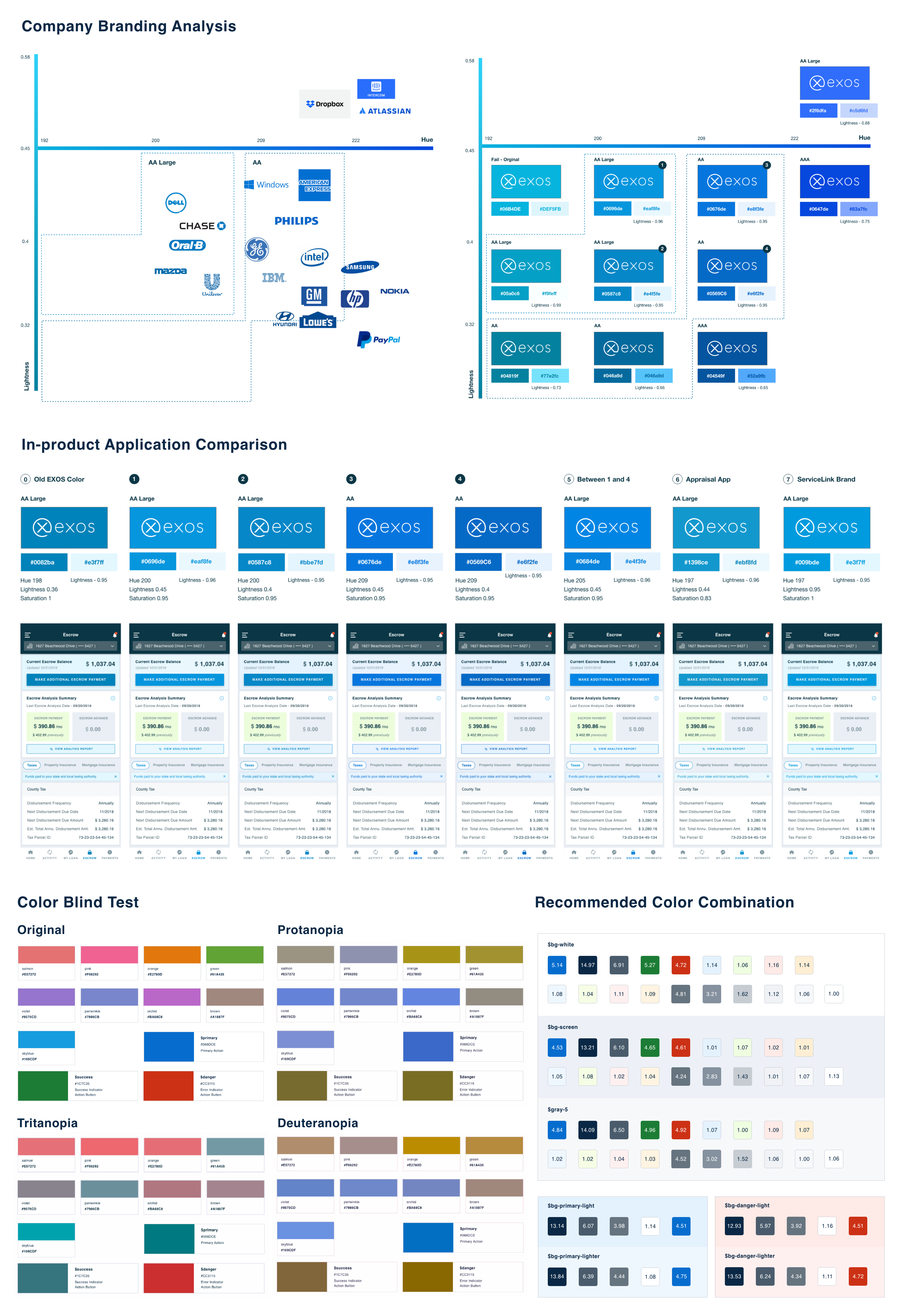
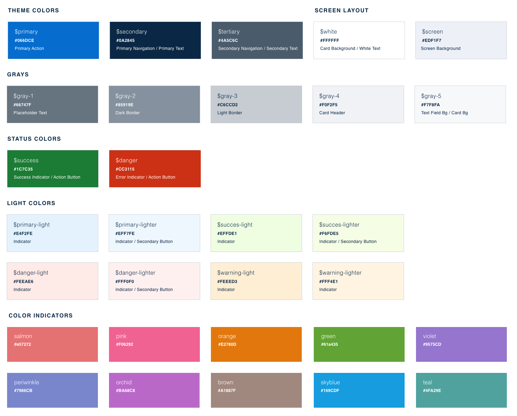
We defined a new color palette with clear naming conventions, usage guidelines, and recommended accessible color combinations.
Typography: Dynamic System Fonts
After evaluating both commercial licensing costs and development customization effort, we chose a dynamic system font approach—using the operating system’s native fonts rather than a single branded typeface. While this was not the strongest option for brand expression, it proved to be the most practical solution given the constraints. We then defined font classes with detailed styles and usage guidelines for each platform.

Iconography: Visual Consistency
After evaluating commercial licensing costs and development effort, we chose a dynamic system font approach—using native operating system fonts rather than a single branded typeface. While this limited brand expression, it was the most practical solution given the constraints. We then defined font classes with detailed styles and platform-specific usage guidelines.
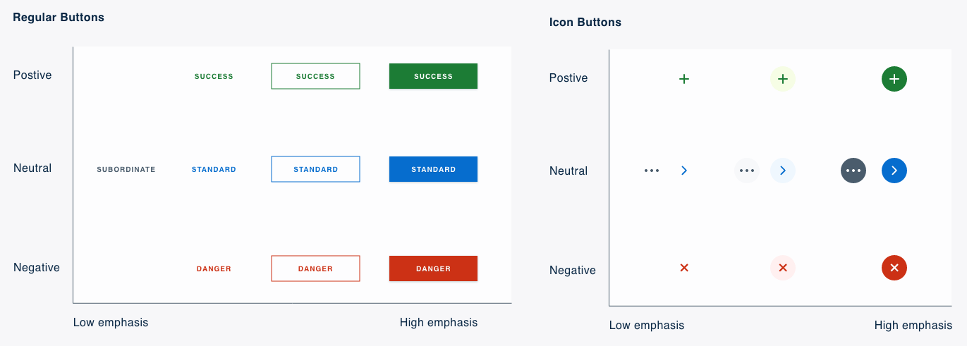
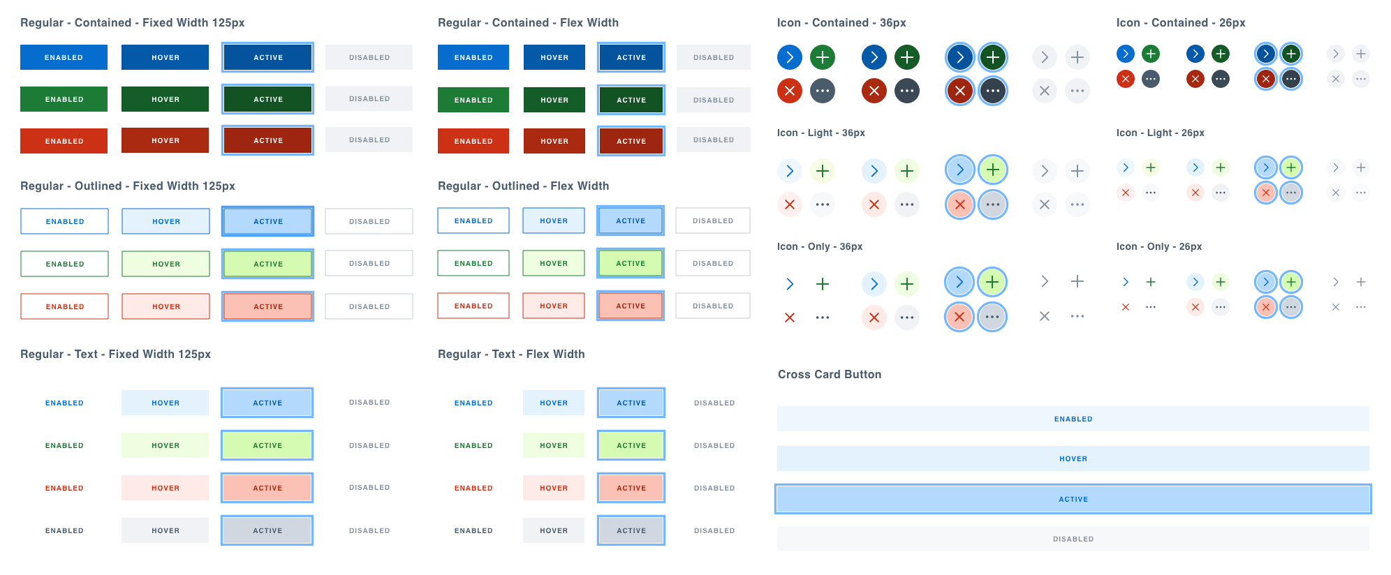
Button
The button system supports four colors: blue (default/neutral), green (success), red (danger), and gray (lower-priority). Regular Buttons have three emphasis levels: Contained, Outlined, and Text. Icon Buttons also have three levels: Icon Contained, Icon Light, and Icon Only. The Cross Card Button serves as both an action and a section divider and is available only in light blue.
Input
Text Fields allow users to enter text, numbers, or special characters via keyboard or other input methods (e.g., voice). Hint text communicates the expected format. Adjustable Text Fields let users resize the field to accommodate longer content. Single-selection lists allow users to choose one option from a set and are typically presented using dropdowns or radio buttons. Multi-selection lists allow users to choose multiple options and are commonly implemented with checkboxes, which require an explicit submit action to apply changes. Toggles represent on/off states and apply changes immediately without requiring a submit action. Chips offer a compact alternative to radio buttons (single selection) or checkboxes (multi-selection), providing clearer visual emphasis for selected options.

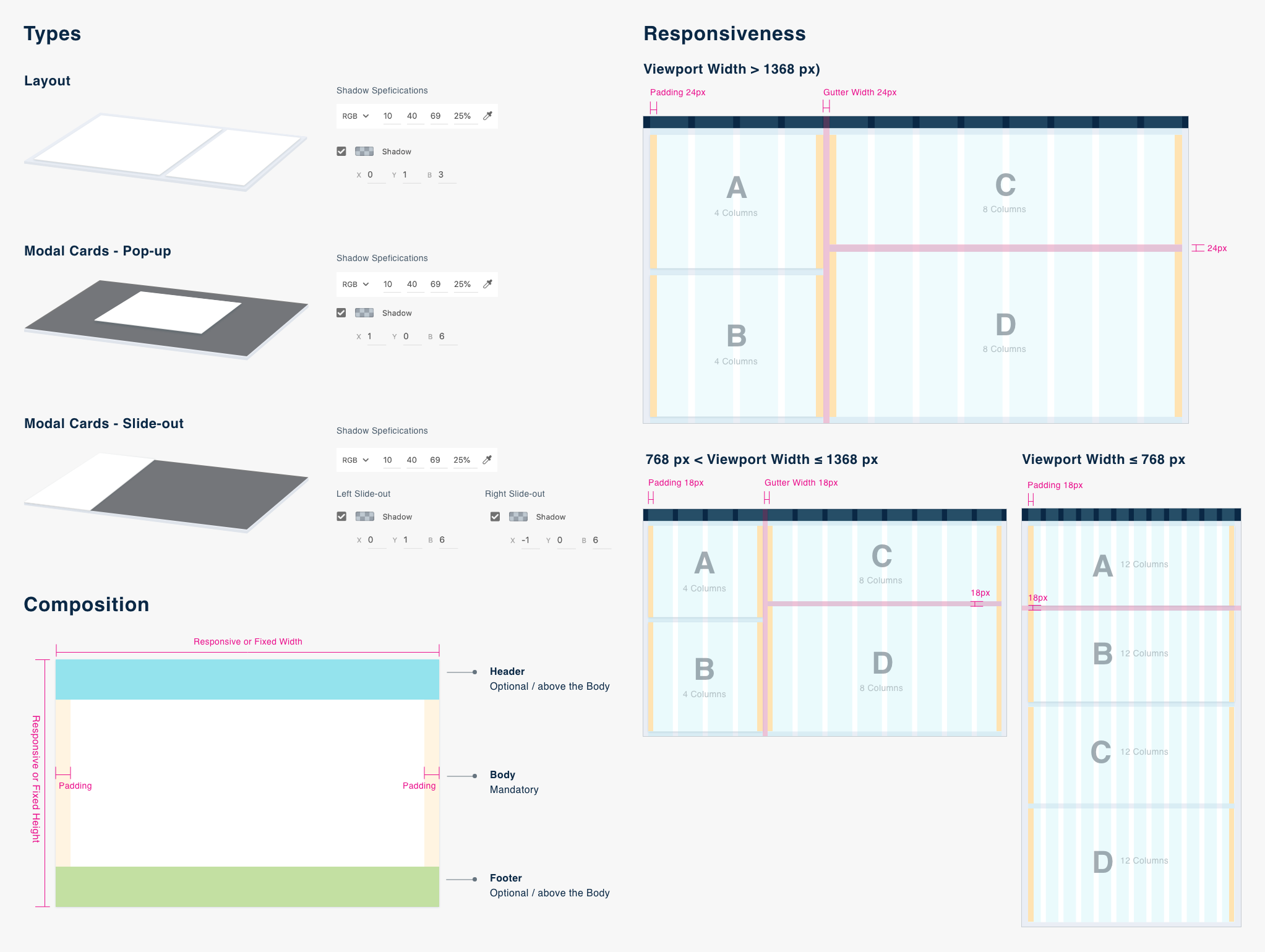
Card
Layout Cards define layout structure and group related content. Modal Cards present focused information or actions and come in two types: Pop-up Cards (centered) and Slide-out Cards (from the left or right). Card dimensions can be fixed or responsive. Responsive cards are configured by defining column spans at each viewport.
Tag
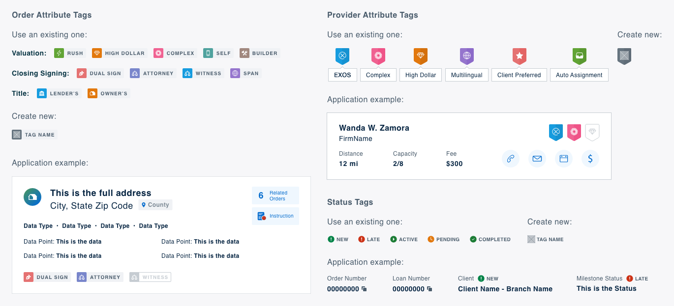
Attribute Tags highlight key characteristics and differentiate items, commonly used for order and provider attributes. Status Tags indicate the state of an order or process and consist of a color-coded icon paired with a text label.
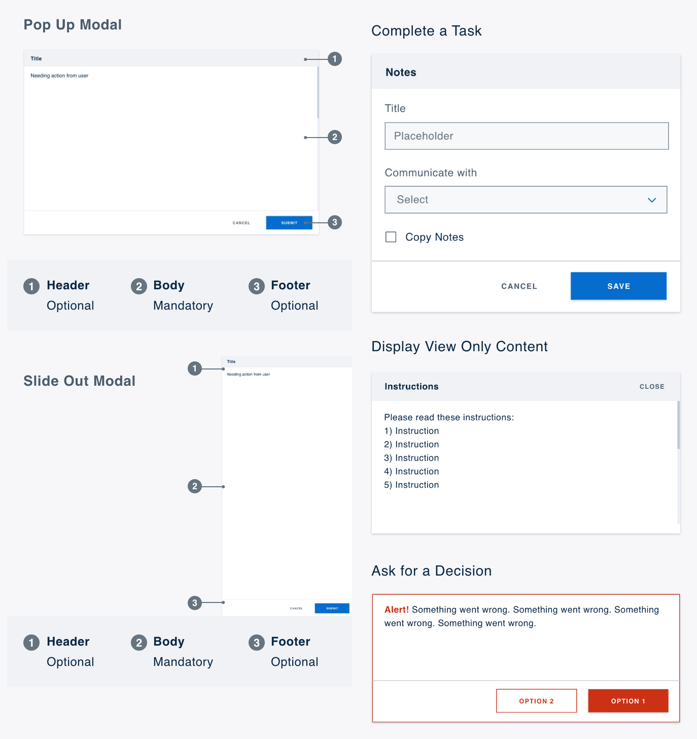
Modal
Pop-up Modals appear centered on the screen, while Slide-out Modals enter from the left or right. Both include three sections: Header (title), Body, and Footer (action buttons). Modals are used to support task completion, display read-only content, or prompt user decisions.
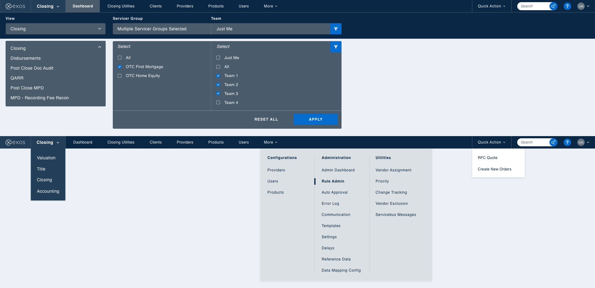
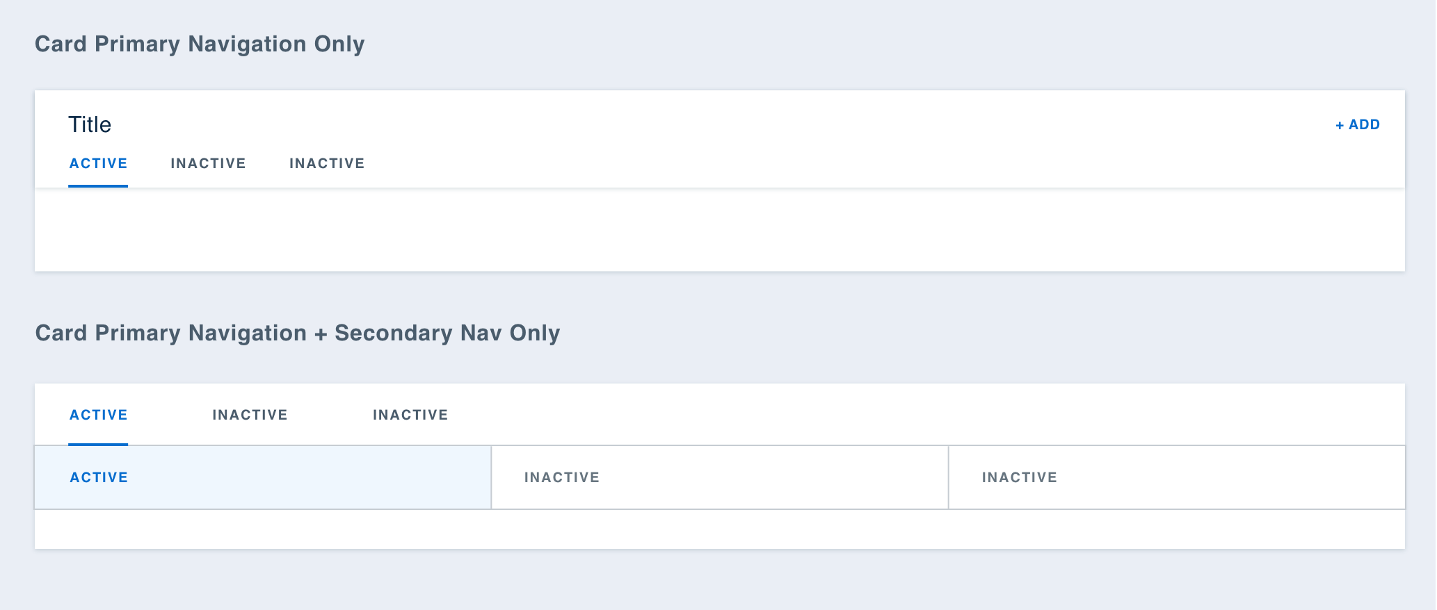
Navigation
Application Navigation communicates the app’s structure and helps users find information. Primary Top Navigation enables movement between top-level entities (e.g., lines of business and products) and provides access to global actions such as profile and search. Secondary Top Navigation sits below the primary navigation and supports navigation between features within the selected product. Side Navigation appears alongside the content area and allows navigation through sub-features within a selected feature.
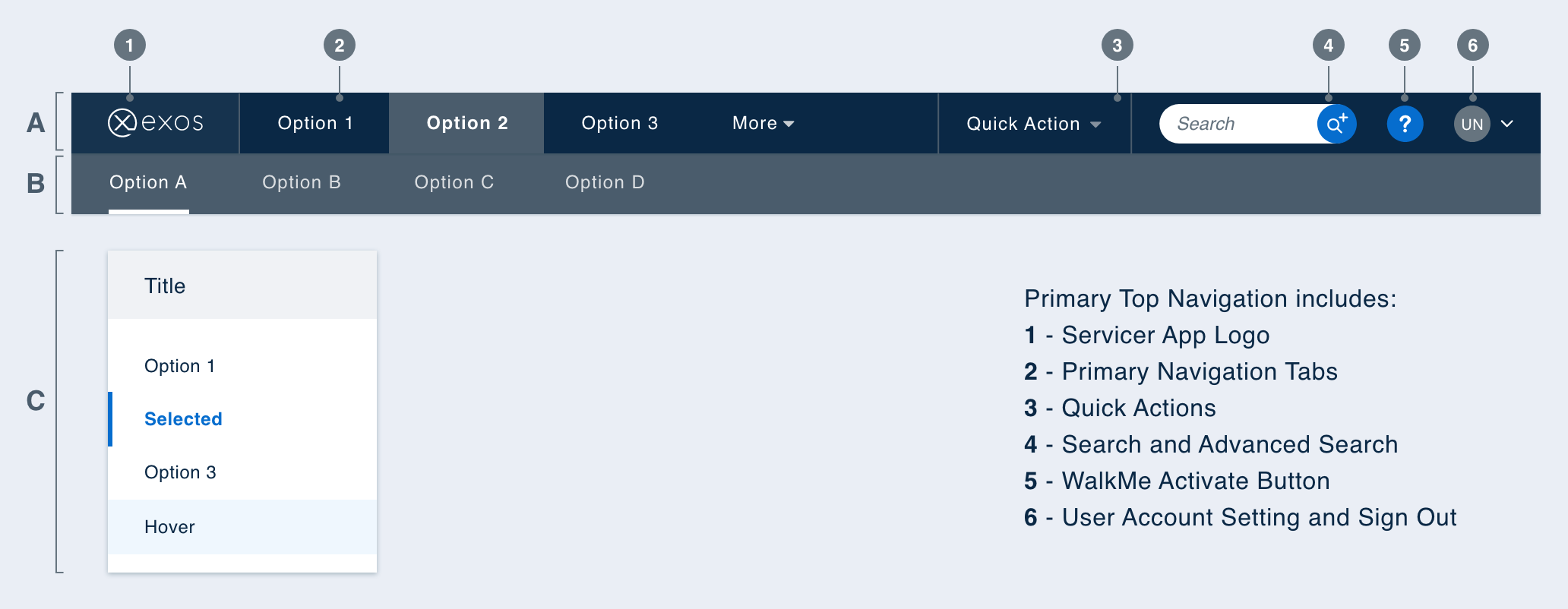
Cards can include their own navigation bar within the header.
Planning & Collaboration
I partnered closely with the UI Lead to define the project plan, facilitate discussions, and manage progress. Each release followed a consistent rhythm: a design sprint for research and creation, a development sprint for implementation and testing, and a post-release phase for communication and feedback.
To ensure quality and reduce communication gaps, we maintained strict alignment between design and engineering. Designers and developers worked from the same source of truth by keeping UI Kit components and design system code in sync through shared design tokens.
We viewed the design system not as a set of rules, but as a co-created toolkit that empowered the team. Rather than relying on a dedicated design system team, we encouraged all UX designers to contribute directly. An “component playground” design file allowed designers to share ideas and comment on each other’s work, while a weekly design system meeting created space for designers and developers to review, debate, and refine solutions together.


Thank you for your attention!
Drop me a line at yingw4@tepper.cmu.edu.
View the next project to learn more: